Ways to Build a Website

There are bunch of ways by which we can get a website up on the Internet. Each way has it’s merits and demerits. In this post I’ll share some ways which I think are fairly quick if you need a simple website up in minimal time. These ways are listed in the order of their coolness.

Static Website Template

If you don’t need anything fancy, then this is certainly the way to go. Just get a nice and pretty looking template from one of those template websites like Themeforest.

Pros

  1. Usually these templates are quite pretty.
  2. Several categories to chose from for templates (like restaurants, medical, etc).
  3. Come with stock/dummy content + images, which are easy to replace.
  4. Support is decent if you buy from a legitimate place.
  5. At times there are free templates too!

Cons

  1. You need to somewhat know your way around HTML/CSS. Otherwise the result won’t be very nice.
  2. Very generic templat-ey looking websites.
  3. Usually overloaded with a dozen varieties of galleries, sliders, etc, thus not efficient.
  4. Can be difficult to maintain if the number of pages in your website is not in single digits.

WordPress Website

I personally used to use WordPress for creating normal and just about every kind of website, and did so for couple of years until I realized how horrible that idea was. However, I believe this is still the most popular way to get static and dynamic websites up. I’m not saying the idea of using WordPress for normal websites is bad, just that I personally don’t like use things which are an overkill. WordPress is loaded and powerful, but do evaluate if you need all those features or not, and if using it is worth it. I use WordPress for this website because this place is essentially a blog only (and WordPress provides me with all the functionality I need).

Pros

  1. Everything from above, plus:
  2. You get a backend enabled website (CMS) fairly easily.
  3. Thus you can easily add or remove pages and maintain them too.
  4. Lots of plugins for quick functionality.
  5. Comes with blog! (duh)
  6. Most ideal for typical users.

Cons

  1. Everything from above (except 4), plus:
  2. The templates are not exactly flexible, it’s alright if you need to change the styling, but if you need to do structural stuff, you are better of creating your own template using something like underscores.me.
  3. I don’t like the file structure and code modularity of WordPress websites.
  4. Not very scalable (at least not neatly), although you can create bunch of plugins for doing bunch of stuff, but there is no central approach like present in other web frameworks.
  5. Most people usually tend to use several plugins and most many of these plugins will slow your website down.

Python/PHP Frameworks

If you kind of know your way around web development, then this is what you should probably do. There are bunch of awesome frameworks but top two (according to me) for a fairly functional website would Flask and Laravel (Python and PHP Web Frameworks). They both offer some great features like front end templates (Jinja2 and Blade) and are driven by things like template inheritance, etc. I know this may not be the most efficient solution for just a website, but it all depends upon your velocity. Personally I can more quickly and more neatly set up a website using Laravel than WordPress.

Pros

  1. Nice, clean and structured code base (because you authored most of it yourself).
  2. These frameworks typically have many modules/extensions which you use for a plethora of tasks (like ORMs for querying databases, form classes for HTML forms, etc).
  3. You write less code because of these already available modules/classes, and typically the building blocks behind these are pretty good.
  4. Because of these, your web site/application would typically be very easy to scale and maintain.

Cons

  1. You actually jumped to web development from web designing here.
  2. You need to be somewhat familiar with web development using Python or PHP.
  3. Maybe be an overkill for many people.

Website Builders

This is typically what people who have no idea about how to make websites do. They are usually offered from shared web hosting providers (like 1&1 Website Builder, etc) and are targeted towards users with no web design experience. There are also services which only do this, two most popular ones of this kind are Squarespace and Virb (owned by Media Temple (which is owned by GoDaddy)).

Pros

  1. Best option for people with no design experience.
  2. You can still end up with a decent looking website since they have a wide range of existing templates to chose from.
  3. Quite fast. It’s like using a rich text editor- for websites.

Cons

  1. Scalability and Flexibility? Lol.
  2. Not so much for customizations either.
  3. No matter what they advertise, but most of the websites which come out of tools like these don’t look very good.

Honorary Mentions

There are also tools like Concrete5 and Sitefinity CMS, in which case I think you would probably be better of with WordPress and also things like Expressions Engine and KendoUI, which I don’t really know what is and how they are better than their free counterparts.
7 Examples of Texture In Web Design

While the recent trend towards “flat” design emphasizes solid color blocks and clean lines, the ability to use texture effectively is still a necessary and powerful tool in the designer’s toolbox. Your use of texture can range from subtle to bold, from colorful to monochromatic, from a slight accent to a focal element  – there are virtually endless ways to use texture creatively in your designs. Texture can be used to add personality to your designs, produce a more immersive environment, and refine the visual experience.

Here are some examples of texture use to give you inspiration:

Jib

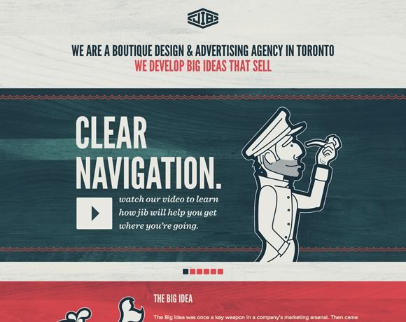
texture01Jib is a design and advertising agency based out of Toronto. Their homepage uses a light wood grain texture to give the site a slight retro feel. This little bit of texture is subtle, but it completely transforms the feel of the site, giving the visitor the impression of age and authority.
You’ll notice that the wood grain spreads across the entire background. While it can be risky using the same texture across an entire page, in this case it works well with the designer’s color choices. It should go without saying, but always pay attention to how your texture choices interact with other elements of your design.

Italiokitchen

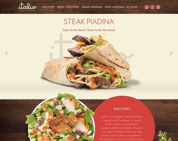
texture02Here’s another example of wood grain, but used as an accent instead rather than as a background texture for the entire page. The contrast of these two examples shows how important it is to consider context when deciding how you’re going to apply texture to your design. You can make nearly any textural element work, provided you keep in mind context.
Marc Thomas

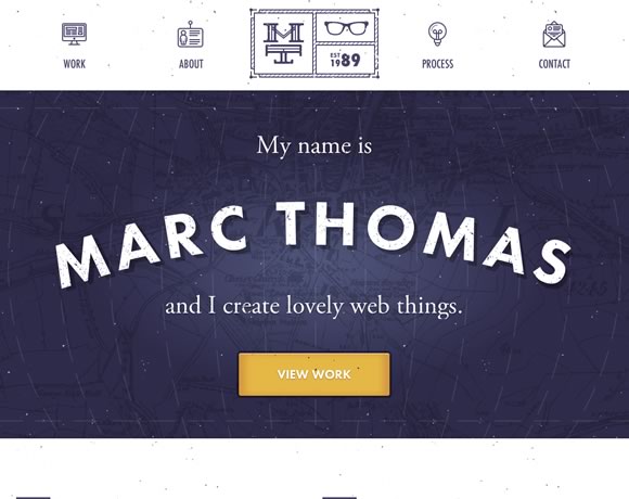
texture03Texture doesn’t have to be something subtle you use to subtly alter the look and feel of your site – it can be the focal point of your design. This splash page is pretty much just a name, background, and call to action button, but the texture is what makes it work.
Here the design is enhanced by the map in the background that functions as a textural backdrop, and the little dots that give the site an “old-school” movie projector feel.

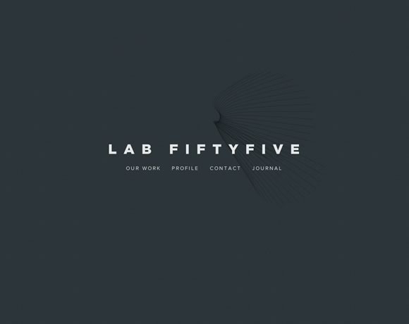
Lab Fiftyfive

texture04This example shows how you can use abstract background elements to accent a simple design. The hint of texture in the background gives this simple business card style layout a much needed element of depth.
This site would also be a great illustration of the power of typography, but perhaps that’s a discussion for another time.

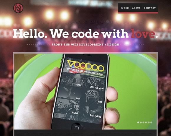
Mode 87

texture05The old “photo as a background” technique is often overused, but there are certainly times when it works well. Here, the background photo is blurred, turning it into a more abstract background than if it were clearly defined. The background blurring also drives focus to the foreground element, which also gives the viewer the impression that they’re at a concert, but completely focused on their phone.

While background images aren’t strictly considered “textures”, a background image to one designer might be applied like a textural element to another. Don’t be afraid to try things that are out of the box.

Arkleus

texture06The use of noise here transforms just another background photo into a something else entirely. Note how the combination of noise texture and dark colors here gives the site a mysterious feel – perfect for a launch site.

I Shot Him

texture07What about incorporating real life texture into your designs? Here’s a great reminder that texture isn’t a design “technique” – it’s a very real part of how we interact with our visual world. We’re surrounded by texture everywhere we look – but a great designer can manipulate that texture to create works of beauty, whether in the real or digital world.
It’s easy to get stuck in a design rut where you constantly go back to design elements that have worked for you in the past, but an important part of growing as a designer is to expand your comfort zone and continuously try new things. Hopefully these examples gave you a few new ideas of how you can incorporate texture into your own designs.

This guest article was written by Simon. He is currently working for Jangomail a cool provider.

Vivid Photo Free Photography Template Now Available

So, I have just completed my first photography website template, the template’s name is “Vivid Photo”. This one is also single page uses extensive jQuery and HTML5 and a lot more modern functionalities. You can download it from its release page at https://priteshgupta.com/templates/vivid-photo/.

You are free to use it for your personal as well as commercial projects as it is released under New BSD License. If you have any issues related to it, you can contact me via the contact form at https://priteshgupta.com/contact/.

Here is a small preview of the template, but head over and see the Live Preview to have a look at its functionalities, go to the Release Page for full details.
Vivid Photo
Download it from here.

Immaculate Portfolio Template v1.0 Now Available

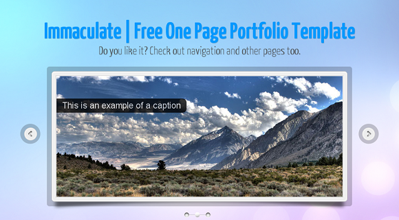
I have made another free template “Immaculate”. This one is a single page website template, with smooth scrolling, has 6 skins included in it, working ajax contact form, useful shortcodes and a lot more. This one also uses HTML5 and CSS3 and is fast loading while being cross browser compatible. You should definitely head over to its release page at https://priteshgupta.com/templates/immaculate/.

You are free(And recommended ;-)) to share and use it. You are free to use it for your personal as well as commercial projects as it is released under New BSD License. If you have any issues related to it, you can contact me via the contact form at https://priteshgupta.com/contact/.

Here is a small preview of one of the skin of the template, go to the Release Page for full details.
Immaculate
You can see the live preview here and download it from here.

Optimize Website Load Time | Compression Tools and Techniques

While making websites we often consider using a lot of scripts and styles in order to increase interactivity and make the website richer. As a result, we end up with slow website, while you can of course remove those scripts and styles to make it load faster Or you can make is load faster without removing any functionality by doing some easy tricks.

Compressing JavaScript

While compressing JavaScript is most recommended and has a great impact in website load time(Generally they are already compressed for many jQuery plugins). There are many tools and methods using which you can compress JavaScript, few most common tools are Yahoo’s YUI Compressor, Dean Edwards’ Packer, Douglas Crockford’s JSMin, Dojo ShrinkSafe and gzip or htaccess(explained later), these things may be sounding strange, but using them is very easy. These JavaScript minification tools preserve all the features of the JavaScript code, but reduce the code size by compressing them. There is no ‘best’ JavaScript compressor, each one of them have  their plus and minus, but you can always compare between the compressors at http://compressorrater.thruhere.net/, its really a nice tool.

Compressing CSS

CSS compressing is also a good technique to optimize website’s load time, there are many CSS minification tools too. Here is a great article on Design Shack for CSS Minification, you should definitely head over: 18 CSS Compression Tools and Techniques and one more at Cats Who Code which explains how you can do it just by PHP: 3 ways to compress CSS files using PHP.

gzip and htaccess

Understanding simply, if you use gzip or htaccess compression, what happens is your website files gets compressed, and the compressed files are send over to the web browser, and the web browser extracts it and shows it to the users. It reduces response time by reducing the size of the HTTP response, this trick is definitely beneficial. There are many tutorials for gzip compression, a good one is at Samuel Santos’ blog: Improving web performance with Apache and htaccess.

Compressor Tools

There are many websites where you can compress your code, here I am including some of the noteworthy ones.

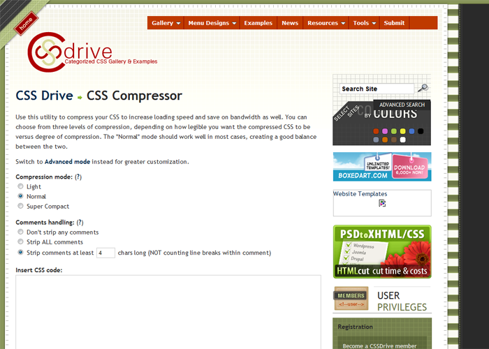
CSS Drive Gallery- CSS Compressor


CSS Drive Gallery  CSS Compressor

Compressor.Ebiene.de


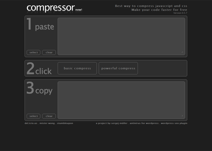
Compress javascript and css. Amazing code compression. Quick easy and free

/packer/


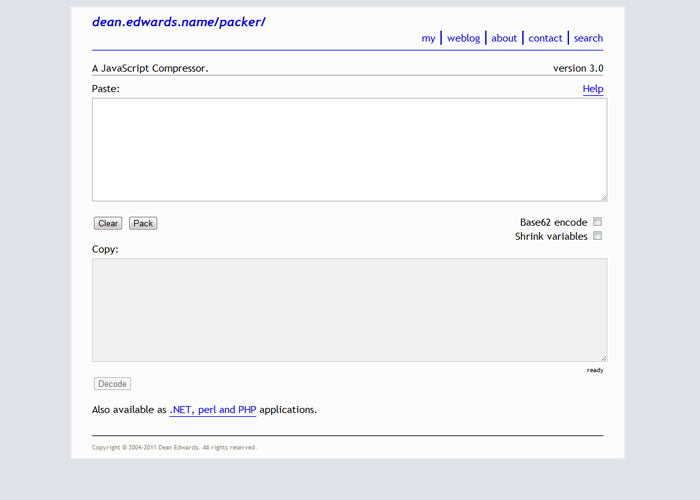
packer

Javascript Compressor


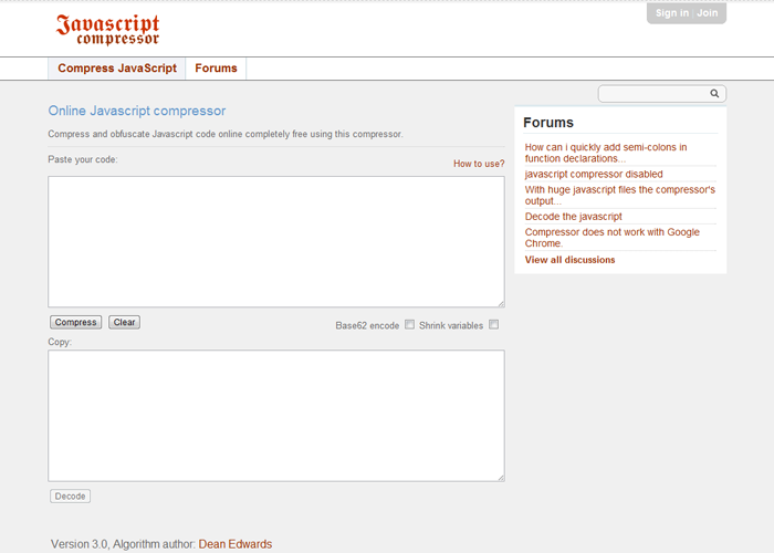
Javascript Compressor   compress code online for free

CSS Compressor


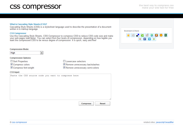
CSS Compressor   Online code compressor for Cascading Style Sheets

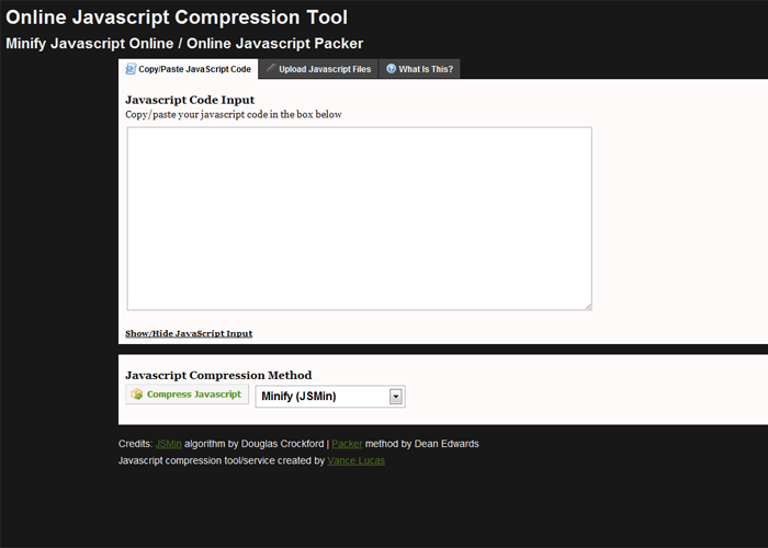
Minify/Pack Javascript Online


Minify Javascript Online   Online JavaScript Packer

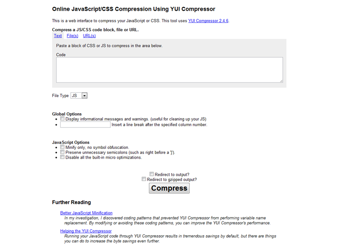
Online YUI Compressor


Online YUI Compressor

Performance Tools

There are few extensions/add-ons too using which you can check the performance of your website and suggests ways to improve the performance. One of them is YSlow by Yahoo, it has a Firefox Add-on as well as a Chrome Extension. There is one more web based tool Page Speed Online hosted at Google Labs, which is equally good. There is also a simple gzip test tool: GIDZipTest.

Conclusion

Our website’s performance is an important factor, and one of the main things in it is the website load time, if our websites are slow, there are chances that user won’t return. Also, these compression techniques are easily doable by editing the .htaccess file or by adding simple snippets using php or using those web based tools. Thus, you should definitely consider doing these tricks.


Dummy Content for Websites

When making or developing websites, web designers often need sample content and creating sample content again and again is a chore. Thankfully there are couple of places where we can get dummy content for our websites, we just need to copy and paste them and showcase it to clients and some tools too which create dummy contents in a click for your CMS.

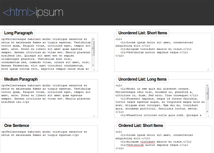
<html>ipsum


html ipsum
Here you can get preformatted sample HTML content, it has various formats like ul, ol, table, form etc. I think this website is really handy while making websites, especially because of the dummy content’s multiple formats, you should head over and check it out definitely.

For WordPress

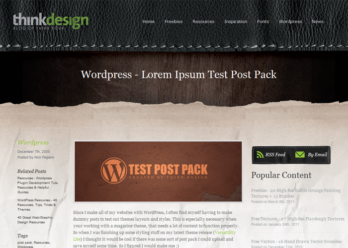
Lorem Ipsum Test Post Pack
While there are many dummy content import files for WordPress, but there is no use for a dozen of them if one does the job fine, you can head over to WordPress – Lorem Ipsum Test Post Pack and check it out. The Test Post Pack has formatted text for 30 posts, test pages, categories, sub categories, etc. Alternatively, you can also try out WP Dummy Content plugin.

Dummy Content Generators

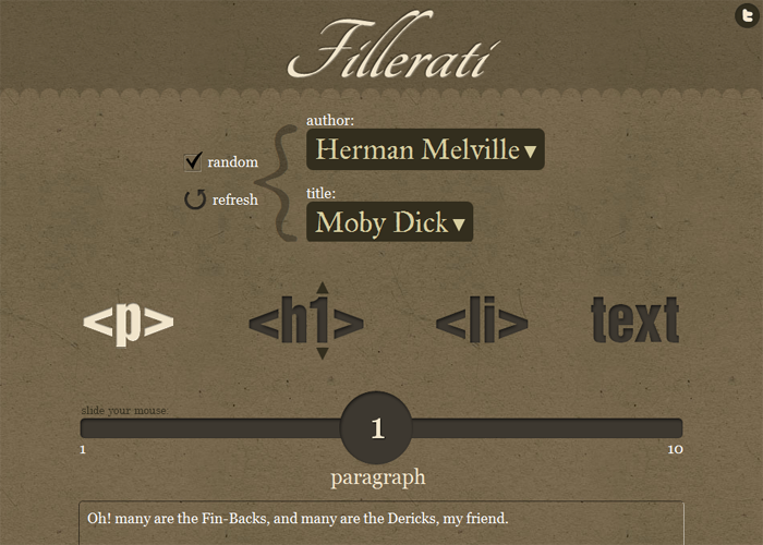
Fillerati – Faux Latin is a Dead Language


Fillerati - Faux Latin is a Dead Language
I you are bored of using Lorem Ipsum in your websites then you can try this website, the website is made using HTML5. Rather than Lorem Ipsum text, this website gives extracts from English literature.

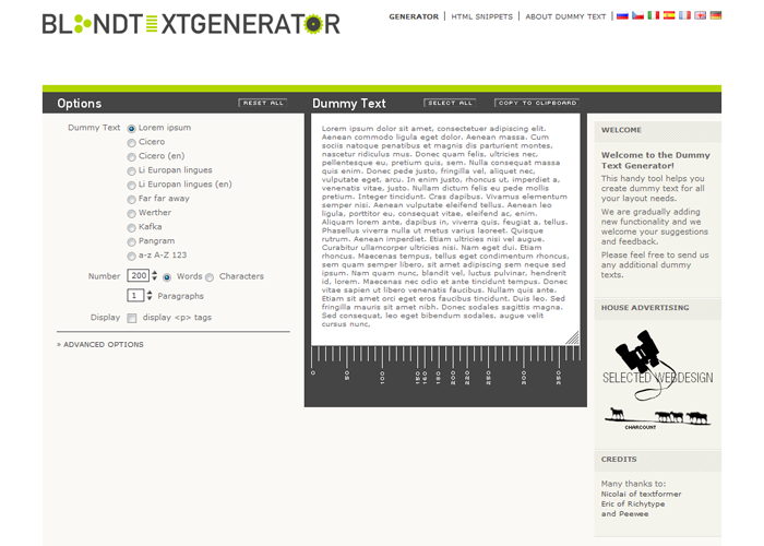
Dummy Text Generator, Lorem ipsum for webdesigners


Dummy Text Generator, Lorem ipsum for webdesigners
This website helps you create dummy content in various formats and layouts.

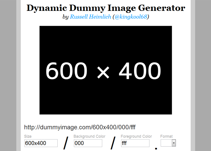
Dynamic Dummy Image Generator – DummyImage.com


Dynamic Dummy Image Generator - DummyImage.com
This website creates images of custom dimensions and allows you to chose between background and foreground colors, you can even add dummy text, use multiples formats(.jpg, .png, etc) and do a lot more. For me it is a really nice tool.

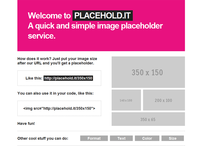
Placehold.it – Quick and simple image placeholders


Placehold.it - Quick and simple image placeholders
Something like DummyImage.com only.

Elegant Press Website Template Version 1.0 Now Available

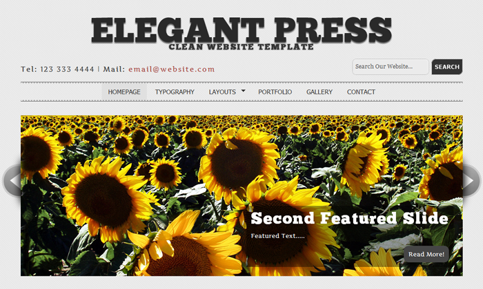
So I have finally completed my website template “Elegant Press”, it has been made using HTML5 and CSS3, it is cross (modern)browser compatible, has web fonts, jQuery plugins, etc. Overall, its awesome and totally free! Its licensed under New BSD License, read more about it here, you should surely give it a try. You can see its release page at https://priteshgupta.com/templates/elegant-press/, you can download it for free from there.

Feel free to share and use it. You are free to use it for your personal as well as commercial projects as it is released under New BSD License. If you have any issues related to it, you can contact me via the contact form at https://priteshgupta.com/contact/. Please note this theme is not made for older browsers and looks funny on them, but who cares?

Here is a small preview, go to the release page for full details.
Elegant Press
You can see the live preview here and download it from here.

Design Kindle: Awesome Website for Free Web Design Files

Design Kindle is a community driven web design resources website which offers premium quality web design files like graphics, vectors, icons, textures, etc for absolutely free with no required membership. Isn’t this awesome? Thats not all, all the stuff here is royalty free and we are free to use them in our personal and commercial projects, without the necessity of linking back to them.You can visit the website at http://www.designkindle.com/. I personally liked their free graphics collections a lot, they are totally amazing and very useful in creating websites.

If you know any other website like this, feel free to share.

Using Website Templates: Free vs Premium

Often Web Designers try to provide quick web design services to clients and for a low price to live up the competition. It is recommended in this case to use website templates to save time as well work within the client’s budget. There are ample of templates available for websites online, these templates are free as well as paid(premium). Templates can vary from client to client according to their website specifications/requirements. It is a myth that paid templates are better than free ones. While it is not always true.

Free Templates

In a free Website template you get a well put up website layout, with good CSS and minimal codes. Free Website Templates might not be heavy on JavaScript like jQuery plugins, or at times dont even include a simple image slider or any JavaScript at all. But this doesnt makes it an unfavorable option. You can add jQuery plugins like prettyPhoto for image galleries/lightboxes and you can use Google Web Fonts for typographies. These small customizations take your Free Template to Premium Template standards and are very easy to be implemented on your Template. You can customize these templates to a large extent and change the glance of the template according to your creativity. This would be an example of free website templates site, there are many more, may be many better ones too. But I personally like this one because, the website templates here are clean, well laid out and not messed up, that is minimal. It gives the web designer a good opportunity to work, and be artistic. Thats why for me free templates work as good as paid templates. Though be careful when using these templates, they at times have Copyright/Licensing restrictions.

Premium Templates

Premium Templates are like a ready made websites, most of them already have required scripts like JavaScript for Image Galleries, etc in place, where you just need to edit or add little HTML, they even have the best suited typographies already in them. Some of them have PHP forms also in place for Contact Pages. If time is an important element of your website, then you should go with Premium Templates as they generally require lesser customization, everything is styled in best possible manner with best possible appearance of the website and they have all functionalities needed by a standard website, most of them even provide support too which can help you if you are stuck somewhere. Customizing Premium Templates like changing color scheme, design, background etc is not difficult, they usually have PSDs included in them and at times come with various layout options and color schemes.

Going with Templates

Templates might be an easy way out, good in appearance, saves time, etc, but this doesn’t makes them the best option. Thousands of websites are made everyday, but good Templates are not that many. What happens generally is that those few templates gets used again and again in many websites, which takes away the exclusive feeling of your website. At times the client even mention not to use Templates at all, and fooling them is completely unethical. To overcome these, you should customizing the Template as much as you can, remember over customizing will just end you up in an ugly website. Just make sure your website stands apart in the crowd.

Conclusion

All in all, both the types of templates are good. Free templates just require little more of work than premium templates. Premium Website Templates are like completely cooked dish, and in Free Templates you need to cook little more at times, but you save $ also. In Premium Templates, you generally just need to fit content into it, style a little, and done. Also, if you want to show your real creative and artistic skills, then you can drop the template idea, and can create the whole website yourself, or just borrow a framework layout from your WYSIWYG editor like Dreamweaver.

UPDATE: Check out my free website template Elegant Press at https://priteshgupta.com/templates/elegant-press/.

Tips for writing HTML Emails

Web Designers often create HTML Email Templates and face the problem of its compatibility on Email clients and Webmail especially. It might be like, Its running good on Yahoo, AOL. But fails in Gmail. Quite often, HTML Emails fail to load on Outlook 2007 and Outlook 2010.

I’ll like to share some tips using which one can create successful HTML Emails. So that your HTML Email loads properly in all the Mailboxes and Email clients

  1. The first basic rule of HTML Email is one single file, that is you can’t attach a style sheet. And you shouldn’t probably call it too, you should simply include something like
    {code type=HTML}<style type=”text/css”>.
    /* Your Style sheet */
    </style>{/code}
    Within the <head> of your Email HTML Template. But there is a big problem with it, Gmail doesn’t supports a style sheet, its only supports inline CSS. Thus you’ll need to convert it into an inline type with no external references to style using #Tags. That is something like {code type=CSS}<p style=”font-family: “Verdana”, Arial;”>{/code} Also, attachments are often stored in randomly named temporary cache folders by some email programs. They also hog a lot of bandwidth (especially when they bounce) so attachments are not the way to go. Simply upload your images into a public-accessible web sever and call your Images from there. Also remember not to resize the Image, stretched images may not render properly. All graphics should have their correct dimensions.
  2. Another thing important is, use as less CSS as you can . Desktop Email clients, mainly Outlook 2007 and Outlook 2010 doesn’t support most of the CSS. Outlook often converts your DIVS to paragraphs, so your DIVS will be messed up. Also, Avoid using “margin” or “padding” CSS properties in your TABLE tag. Cellpadding and Cellspacing attributes are generally safe but margin or padding will often be added to every TD within the table. Also, Outlook 2007 and 2010 impose a 2-pixel height minimum for table cells. So, for example, if a table cell contains a 1-pixel transparent gif and a background color, your ‘horizontal line’ will appear thicker than expected.
  3. Tables is the safest thing to use in HTML Email. Do not rely on CSS based layouts. Make Email layouts completely based on Tables. You may also nest tables in your HTML template. Its completely safe.
  4. One more thing important is, don’t have too wide templates for your HTML Email Template. We are not designing HTML sites here. The width should exceed 600px I believe. Think small!
  5. After you are done you can test you email in virtual Email simulation and testing websites. One good site I came across was http://www.emailonacid.com, here you can see how your Email will look in various Email programs.

I hope the above points help you. Good luck!