110 Best CSS3 Tutorials and Examples

I have been publishing articles about CSS3 for a while now. CSS3 opens the door for a lot of unique techniques for websites, that is why CSS3 has acquired an important place in web design. Earlier web designers were forced to use Photoshop for various things like gradient, shadows, etc, and jQuery/JavaScript for simple animations. There was no method to implement these functionalities using CSS. But then CSS3 came with its fantastic features. In this article, I have collected a huge list of the best CSS3 examples and tutorials on the Internet. For CSS Tools, check out this.

CSS3 Animated Navigation Menu

Navigation menus play a crucial role in web design and a good navigation menu is definitely a plus to the design. Lately I was playing around with CSS3 for a navigation menu and I learnt how to create an animated navigation menu by only using CSS3(No Images, No JavaScript). Using CSS3 in place of jQuery/JavaScript for animations has obvious advantages like faster load time, lesser heavier website, etc. In this article I am sharing the code of a navigation menu made using CSS3. It renders perfectly on Chrome, Firefox, Safari and Opera. And without the easing effects on Internet Explorer and non CSS3 compatible browsers. Pure CSS3 Navigation Menu
Live Demo // Download

The CSS

body {
    font-family: 'Lucida Sans Unicode', 'Lucida Grande', sans-serif;
    background: #545454;
    margin: 0;
    background: -webkit-gradient(linear, left top, right bottom, from(#545454), color-stop(.5, #7e7e7e), to(#545454)) fixed;
    background: -webkit-linear-gradient(45deg, #545454, #7e7e7e .5, #545454);
    background: -moz-linear-gradient(45deg, #545454, #7e7e7e .5, #545454);
    background: -o-linear-gradient(45deg, #545454, #7e7e7e .5, #545454);
    border-top: 7px solid #52a8e8;
    text-shadow: 0 0 3px rgba(0, 0, 0, 1);
    letter-spacing: 2px;
    font-size: 20px;
}
a {
    text-decoration: none;
    color: #fff;
}
header {
    width: 850px;
    margin-left: auto;
    margin-right: auto;
}
header nav a {
    position: relative;
    float: left;
    width: 150px;
    text-align: center;
    padding-top: 23px;
    padding-bottom: 30px;
    margin-right: 20px;
    -webkit-border-bottom-right-radius: 5px;
    -webkit-border-bottom-left-radius: 5px;
    -moz-border-radius-bottomright: 5px;
    -moz-border-radius-bottomleft: 5px;
    border-bottom-right-radius: 5px;
    border-bottom-left-radius: 5px;
    -webkit-transition: all .5s ease-out;
    -moz-transition: all .5s ease-out;
    -o-transition: all .5s ease-out;
    background: #52a8e8;
    background: -webkit-gradient(linear, left top, left bottom, color-stop(.2, #52a8e8), color-stop(1, #4984ce));
    background: -moz-linear-gradient(center top, #52a8e8 20%, #4984ce 100%);
    background: -o-linear-gradient(#52a8e8, #4984ce);
}
header nav a:hover {
    padding-top: 53px;
    padding-bottom: 60px;
    -webkit-transition: all .5s ease-out;
    -moz-transition: all .5s ease-out;
    -o-transition: all .5s ease-out;
}

The HTML

<header> <nav> [HOME][1] [ABOUT][1] [WORK][1] [CONTACT][1] [BLOG][1] </nav> </header>

Vivid Photo Free Photography Template Now Available

So, I have just completed my first photography website template, the template’s name is “Vivid Photo”. This one is also single page uses extensive jQuery and HTML5 and a lot more modern functionalities. You can download it from its release page at https://priteshgupta.com/templates/vivid-photo/.

You are free to use it for your personal as well as commercial projects as it is released under New BSD License. If you have any issues related to it, you can contact me via the contact form at https://priteshgupta.com/contact/.

Here is a small preview of the template, but head over and see the Live Preview to have a look at its functionalities, go to the Release Page for full details.
Vivid Photo
Download it from here.

45 Best Online CSS Tools and Resources

CSS is the language used to design websites and is used by various kinds of people ranging from ultra professionals to newbies. Below I am sharing 45 of the best CSS Tools or CSS Resources, tools which can reduce a lot of your work or help you in writing the CSS. Many of these are specifically for CSS3 too. Browse them out to know more, do drop by if you also know a ‘good’ online CSS tool.
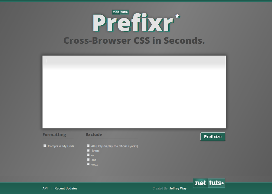
Prefixr: Make CSS Cross-Browser Compatible in Seconds.


Prefixr: Make CSS Cross-Browser Compatible in Seconds.

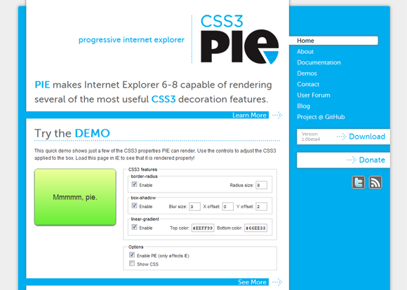
CSS3 PIE: CSS3 decorations for IE

CSS3 PIE: CSS3 decorations for IE

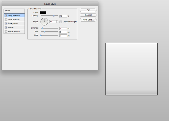
CSS3 Layers Builder


CSS3 Layers Builder

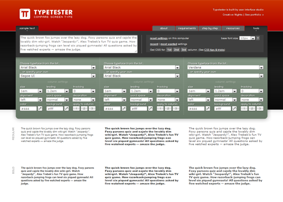
Typetester: Compare fonts for the screen


Typetester: Compare fonts for the screen

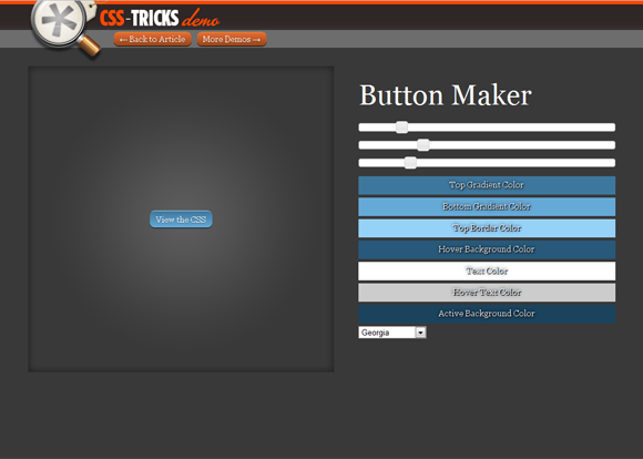
CSS-Tricks: Button Maker


CSS-Tricks: Button Maker

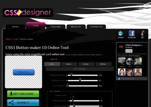
CSS3 Button maker 1.0


CSS3 Button maker 1.0

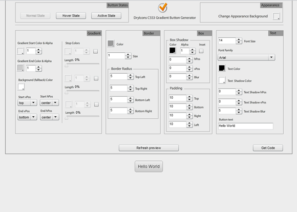
CSS3 Linear Gradient Buttons Generator


CSS3 Linear Gradient Buttons Generator

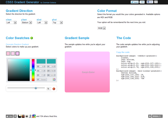
CSS3 Gradient Generator


CSS3 Gradient Generator

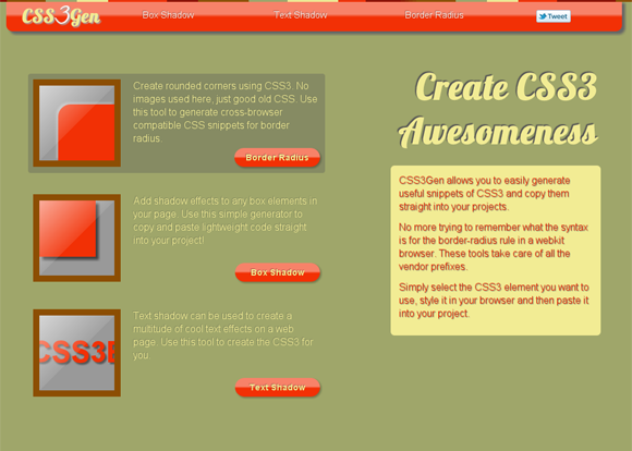
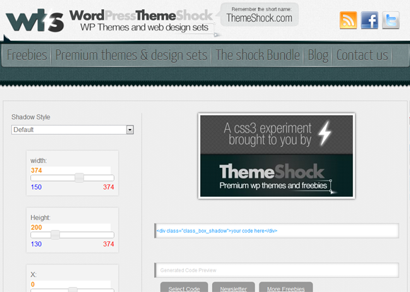
CSS3Gen: CSS3 Generator, Tools and Snippets


CSS3Gen: CSS3 Generator, Tools and Snippets

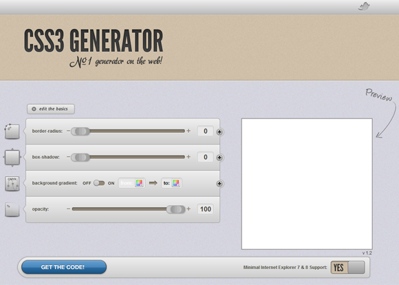
CSS3 Generator


CSS3 Generator

CSS3 Generator


CSS3 Generator

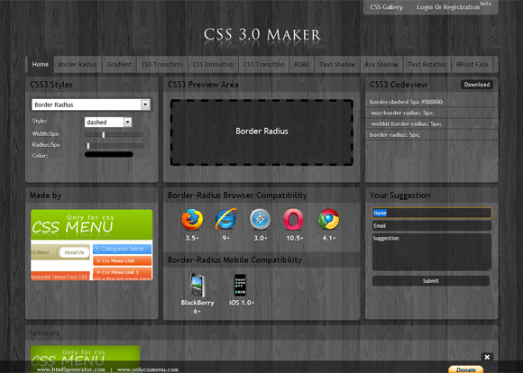
CSS3.0 Maker, Generator


CSS3.0 Maker, Generator

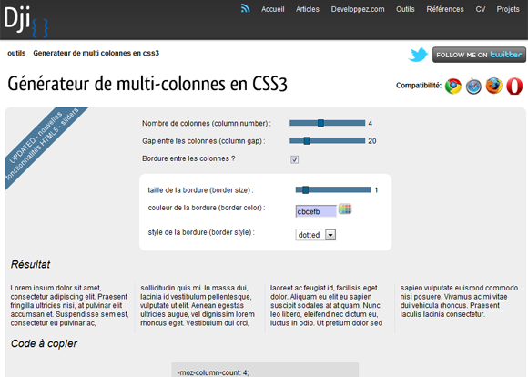
CSS3 Multi-Column Generator


CSS3 Multi-Column Generator

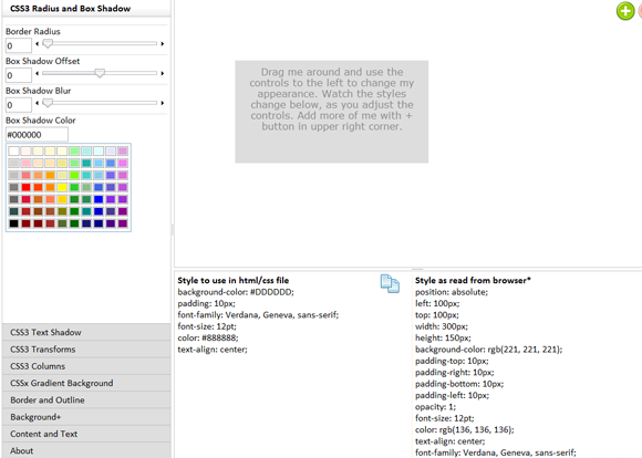
CSS3 Playground


CSS3 Playground

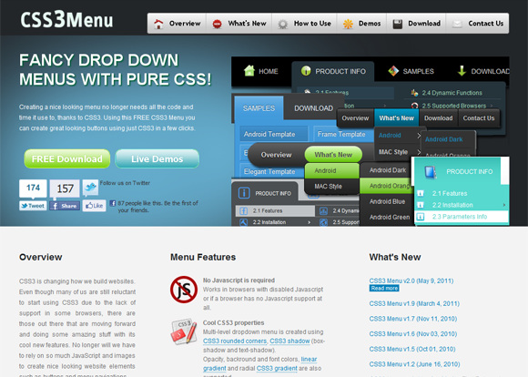
CSS3 Menu


CSS3 Menu

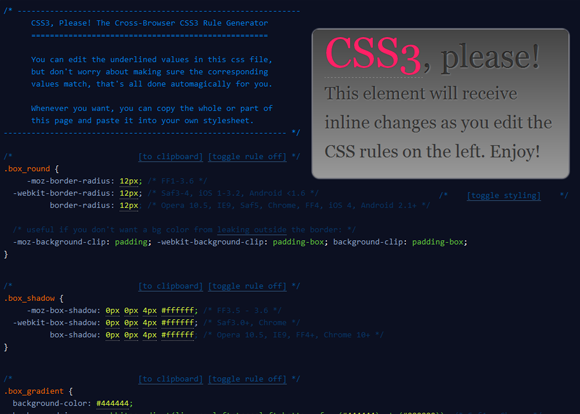
CSS3 Please: Cross-Browser CSS3 Rule Generator


CSS3 Please: Cross-Browser CSS3 Rule Generator

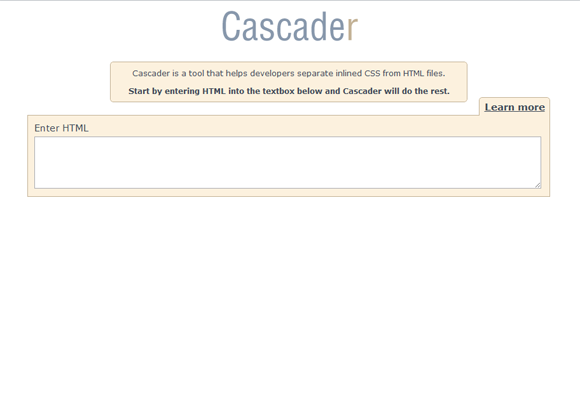
Cascader: Tool that helps developers separate inlined CSS from HTML files


Cascader: Tool that helps developers separate inlined CSS from HTML files

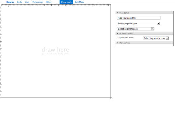
Drawter.com: DrawAble Markup Language


Drawter.com: DrawAble Markup Language

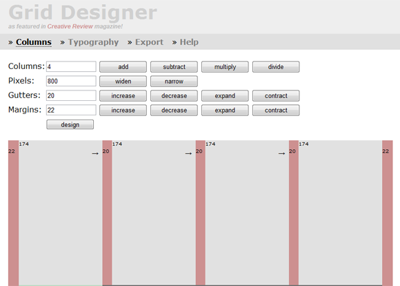
Grid Designer


Grid Designer

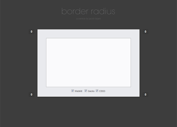
CSS Border Radius Generator


CSS Border Radius Generator

CSS33 Drop Shadow Generator


CSS33 Drop Shadow Generator

Sprite Cow: Generate CSS for sprite sheets


Sprite Cow: Generate CSS for sprite sheets

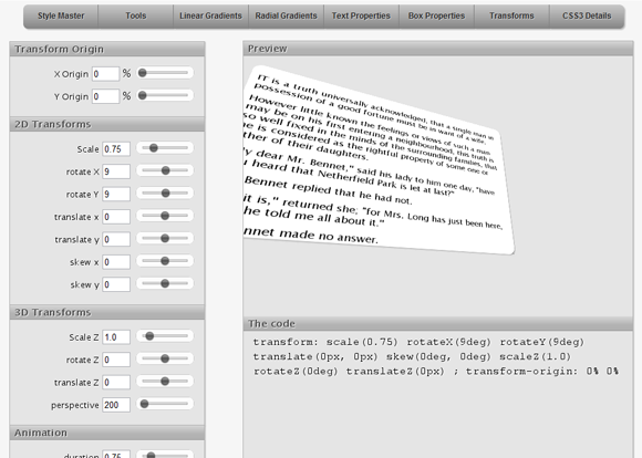
CSS3 3D Transforms


CSS3 3D Transforms

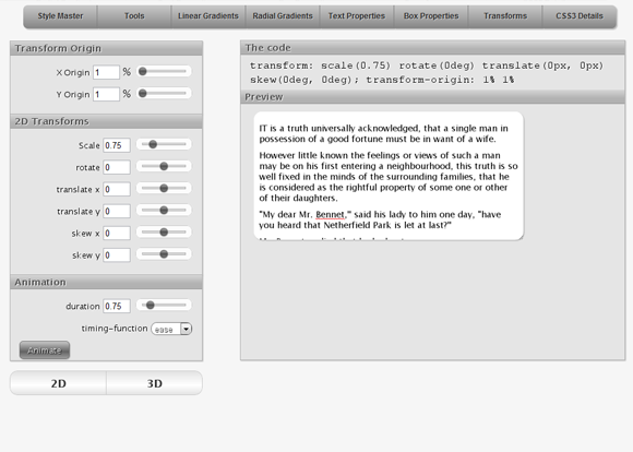
CSS3 Transforms


CSS3 Transforms

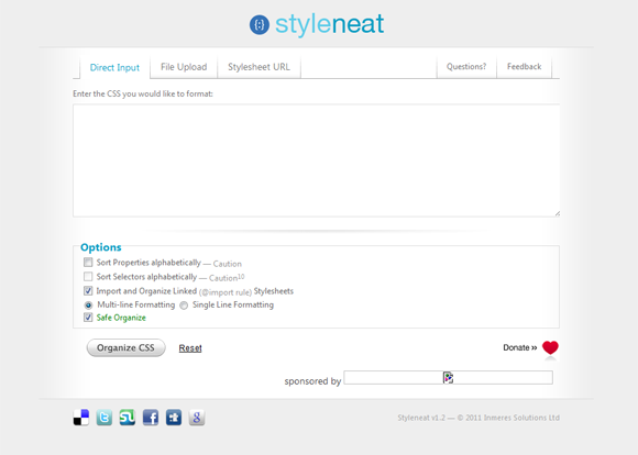
Styleneat: CSS Organizer


Styleneat: CSS Organizer

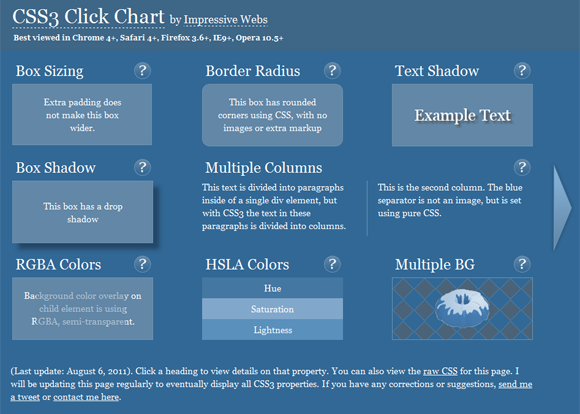
Impressive Webs: CSS3 Click Chart


Impressive Webs: CSS3 Click Chart

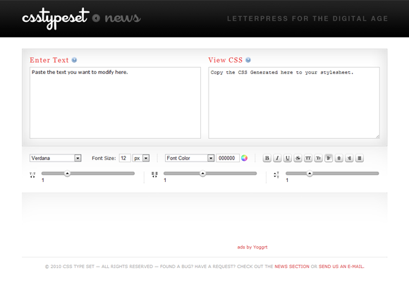
CSS Type Set


CSS Type Set

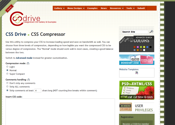
CSS Drive: CSS Compressor


CSS Drive: CSS Compressor

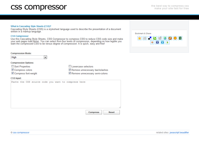
CSS Compressor


CSS Compressor

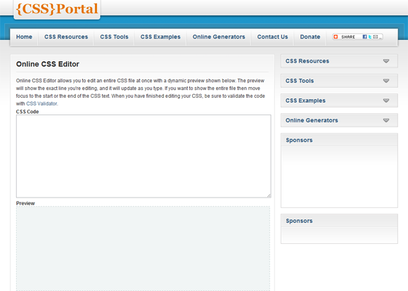
CSS Portal: Online CSS Editor


CSS Portal: Online CSS Editor

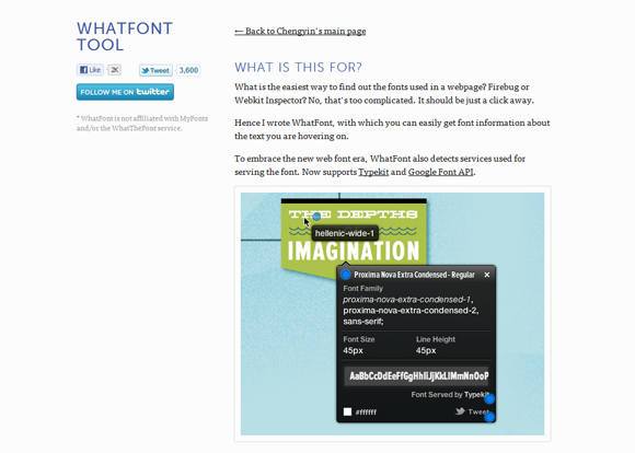
WHATFONT TOOL


WHATFONT TOOL

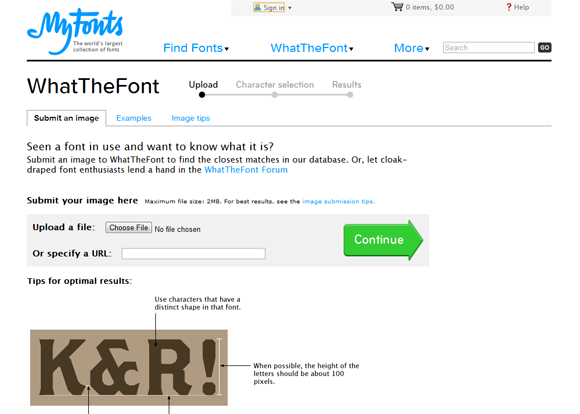
WhatTheFont


WhatTheFont

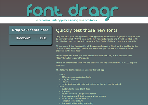
Font Dragr: Web App for Testing Custom Fonts


Font Dragr: Web App for Testing Custom Fonts

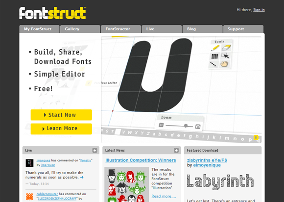
FontStruct: Build, Share and Download Fonts


FontStruct: Build, Share and Download Fonts

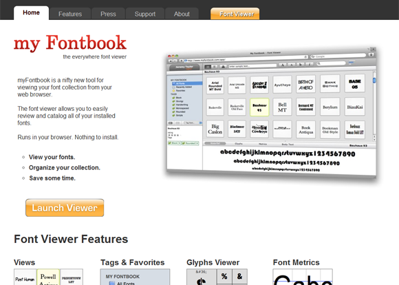
myFontbook.com: Font Viewer


myFontbook.com: Font Viewer

Font Squirrel: @FONT-FACE GENERATOR


Font Squirrel: @FONT-FACE GENERATOR

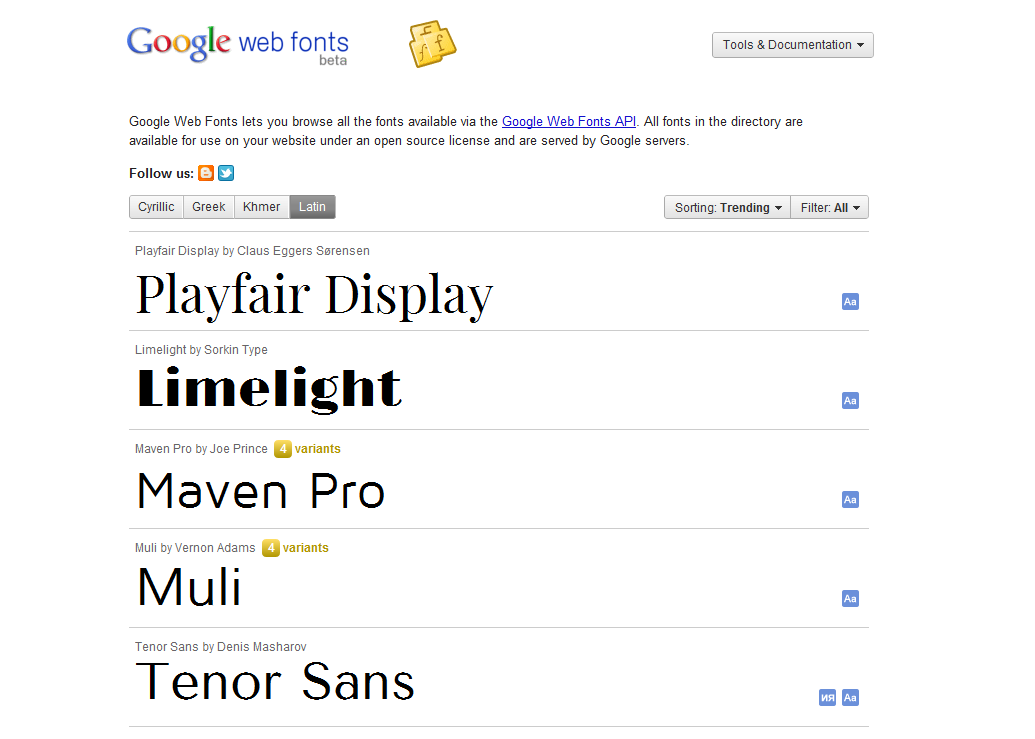
Google Web Fonts


Google Web Fonts

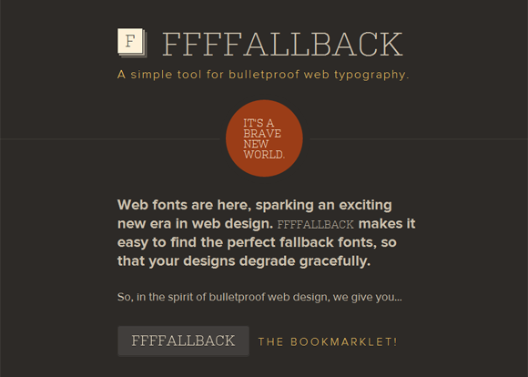
FFFFALLBACK: A Simple Tool for Bulletproof Web Typography


FFFFALLBACK: A Simple Tool for Bulletproof Web Typography

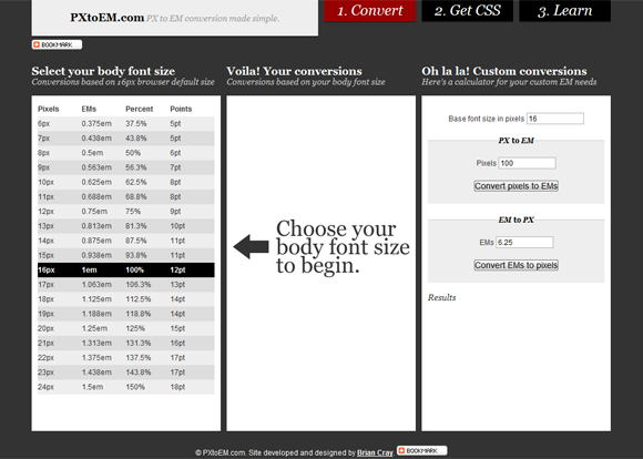
PXtoEM.com: PX to EM Conversion


PXtoEM.com: PX to EM Conversion

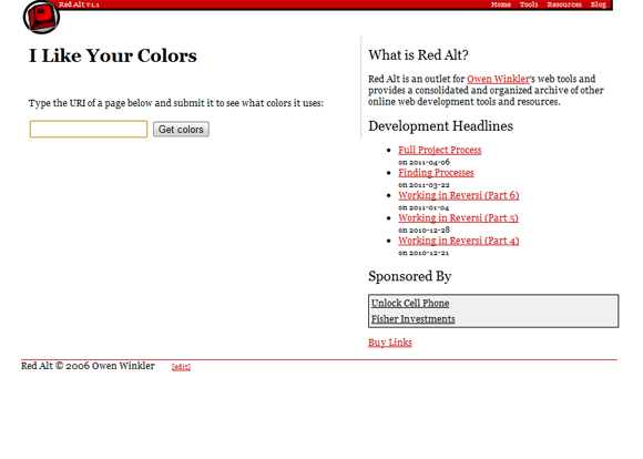
I Like Your Colors


I Like Your Colors

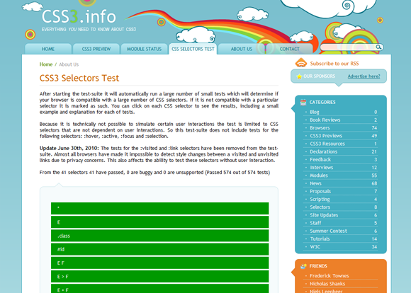
CSS3 Selectors Test


CSS3 Selectors Test

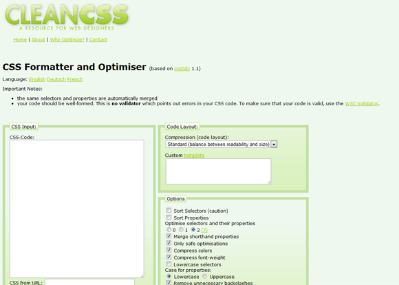
Clean CSS: Optmize and Format CSS


Clean CSS: Optmize and Format CSS

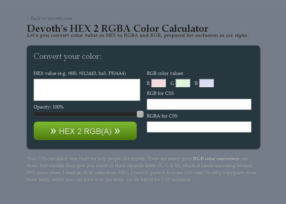
HEX 2 RGBA Color Calculator


HEX 2 RGBA Color Calculator

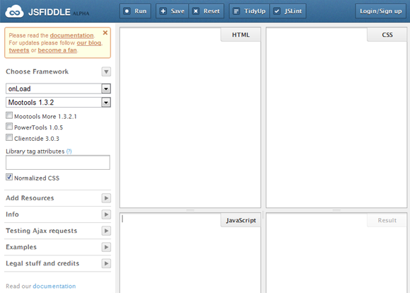
jsFiddle: Online Editor for the Web


jsFiddle: Online Editor for the Web

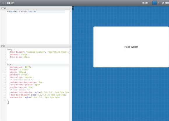
CSSDesk: Online CSS Sandbox


CSSDesk: Online CSS Sandbox

CSS3 Alternative to jQuery .fadeIn() or .fadeOut()

Suppose you have an image with some opacity(transparency), you will like it to be animated(with easing/smoothing effect) to none opacity on hover. This effect is seen in many many websites, and almost all of them use jQuery to achieve it. Even I used to use jQuery for this but while making a website recently I thought that it could be done using CSS instead of jQuery. So I tried it using transition CSS3 tags and I saw it could be easily done with CSS in place of jQuery. Using CSS3 instead of jQuery has many obvious advantages like faster load time of site, lesser heavier website, etc. The effect you achieve by using CSS is absolutely same as jQuery. Live demo can be seen at the end of this post.

The CSS

The CSS is really simple, you can use the below codes intact, or change them according to your requirements. 1s is time duration for the easing effect, ease-out is the easing type, you can even use ease-in, ease-in-out, linear, etc instead of ease-out here and opacity is the opacity/transparency of the element.

Default CSS for the element

{code type=CSS}
opacity: 0.6;
-webkit-transition: all 1s ease-out;
-moz-transition: all 1s ease-out;
-o-transition: all 1s ease-out;
-ms-transition: all 1s ease-out;
transition: all 1s ease-out;
{/code}

Hover CSS for the element

{code type=CSS}
opacity: 1;
-webkit-transition: all 1s ease-out;
-moz-transition: all 1s ease-out;
-o-transition: all 1s ease-out;
-ms-transition: all 1s ease-out;
transition: all 1s ease-out;
{/code}

jQuery Method

Just to compare, using jQuery we can do it like this:
{code type=HTML}

{/code}

Live Demo

Here is a live demo below for the fading effect using CSS, alternatively you can click here.

And doing the same using jQuery(Or click here).

If you will like to see them side by side, you can go here, the left frame uses the CSS3 method and the right frame uses the jQuery method.

Further Reading

Below are the pages of CSS tags used in above codes.

Make CSS Cross Browser Compatible in Seconds

Nettuts+ has launched a new amazing website Prefixr using which you can make your CSS3 Cross-Browser Compatible in Seconds, now you can write the whole stylesheet keeping in mind just one engine/web browser(like webkit or moz) and let this website make it compatible with all other engines/web browsers by adding their respective tags. Prefixr will filter through the applicable CSS3 properties and dynamically update them.

The website is up at http://prefixr.com/. It also given an option to compress the CSS and provides API if you want to execute it directly from your text editor.

Please remember this website is still in Alpha stages and has some bugs like no support for properties like “border-top-left-radius“.

Filling a Glass with Water (Using CSS3)

HTML5 is amazing and list of things which can be done using it is endless. Anyways, I am sharing how we can fill an empty glass with water using HTML5, I am sharing the code snippets for it. Let me know your thoughts on it. A modern web browser(Like Firefox, Chrome, Opera, Safari) will be needed for it. The live demonstration of this can be seen at the end of this post.

The HTML

The HTML is really simple, it has three divs, first for container of the glass, second for the glass and the third for the water in it. The first div(container) is not really necessary.
{code type=HTML}

{/code}

The CSS

This is where it gets a little tricky, the #container has the general styling properties for the container, the #glass again has general CSS properties of the glass. Now in #water, a background image has been used for waves for the water, you can also specify a color instead of the background image if you don’t need the waves. Then comes the transition CSS properties, transition tags are used here for the easing effect after the hover action(when the water has to fall down). Then finally #glass:hover #water comes which defines the CSS properties when the user hovers over the element, transition properties are the CSS tags responsible for these easing effects.
{code type=CSS}
#container {
background: rgba( 0, 0, 0, 0.10);
margin-left:auto;
margin-right:auto;
width: 300px;
border-left: 1px solid #bbb;
border-right: 1px solid #bbb;
border-bottom: 1px solid #bbb;
border-top: 1px solid #ccc;
-webkit-border-radius: 10px;
-moz-border-radius: 10px;
border-radius: 10px;
padding-left: 5px;
padding-right: 5px;
padding-bottom: 30px;
padding-top: 5px;
}
#glass {
background: rgba( 255, 255, 255, 0.50);
border: 1px solid #bbb;
border-top: 1px solid #eee;
-webkit-border-radius: 10px;
-moz-border-radius: 10px;
border-radius: 10px;
width: 300px;
height: 400px;
position: relative;
}
#water {
background-image: url(“waves.png”);
background-position: top right;
position: absolute;
bottom: 0px;
width: 300px;
height: 100px;
-webkit-transition: all 3s ease-out;
-moz-transition: all 3s ease-out;
-o-transition: all 3s ease-out;
transition: all 3s ease-out;
-webkit-border-radius: 10px;
-moz-border-radius: 10px;
border-radius: 10px;
}
#glass:hover #water {
height: 350px;
background-position: top left;
-webkit-transition: all 3s ease-out;
-moz-transition: all 3s ease-out;
-o-transition: all 3s ease-out;
transition: all 3s ease-out;
}
{/code}

Demonstration

Here is a demonstration below for filling a glass with water, alternatively you can click here.

Or if you don’t like the waves(Or click here).

Further Reading

Below are the pages of CSS properties used in above snippets.

6 Websites for Animated AJAX Loading GIF Images

Lately I was making a template which had a working AJAX Contact Form, at first I struggled a little for the loading image, but then I realized there are couple of websites where we can actually get(and generate) amazing loading GIF images easily according to our specifications, most of these sites also provide a wide range of images to chose from. Thus I am sharing some of those websites, hope this is helpful.

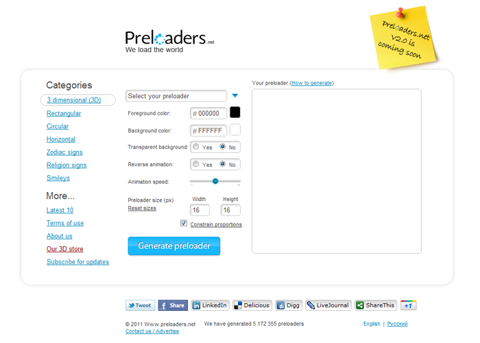
Preloaders.net

preloaders.net   Free AJAX animated loading gif s   3 dimensional  3D

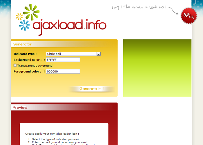
Ajaxload.info

Ajaxload   Ajax loading gif generator

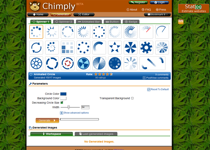
Chimply

Chimply generates your images

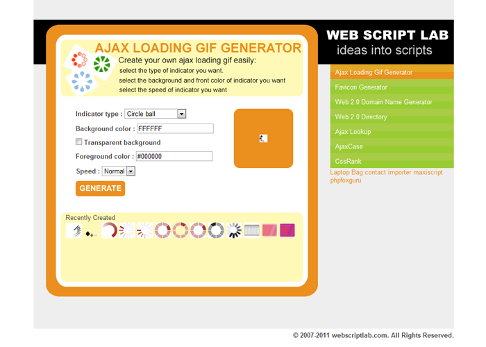
Web Script Lab

Web Script Lab » Ajax Loading Gif Generator

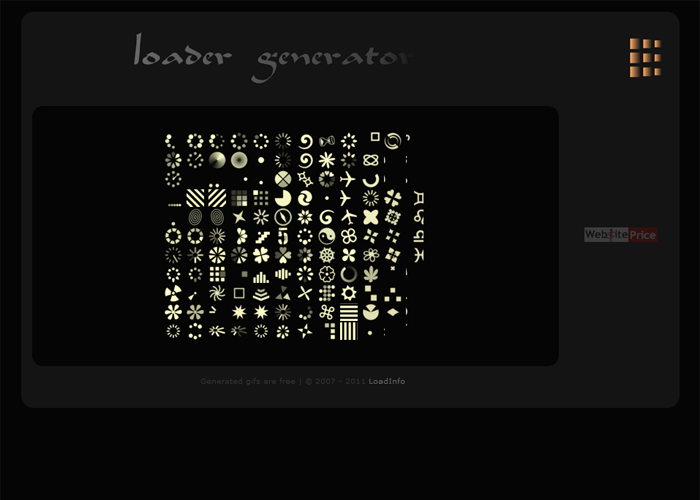
Load Info

Load Info   gif generator

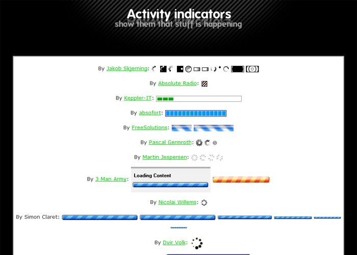
AJAX Activity indicators

AJAX Activity indicators   Animated GIFs designed to indicate your site is doing something

Immaculate Portfolio Template v1.0 Now Available

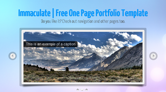
I have made another free template “Immaculate”. This one is a single page website template, with smooth scrolling, has 6 skins included in it, working ajax contact form, useful shortcodes and a lot more. This one also uses HTML5 and CSS3 and is fast loading while being cross browser compatible. You should definitely head over to its release page at https://priteshgupta.com/templates/immaculate/.

You are free(And recommended ;-)) to share and use it. You are free to use it for your personal as well as commercial projects as it is released under New BSD License. If you have any issues related to it, you can contact me via the contact form at https://priteshgupta.com/contact/.

Here is a small preview of one of the skin of the template, go to the Release Page for full details.
Immaculate
You can see the live preview here and download it from here.

Optimize Website Load Time | Compression Tools and Techniques

While making websites we often consider using a lot of scripts and styles in order to increase interactivity and make the website richer. As a result, we end up with slow website, while you can of course remove those scripts and styles to make it load faster Or you can make is load faster without removing any functionality by doing some easy tricks.

Compressing JavaScript

While compressing JavaScript is most recommended and has a great impact in website load time(Generally they are already compressed for many jQuery plugins). There are many tools and methods using which you can compress JavaScript, few most common tools are Yahoo’s YUI Compressor, Dean Edwards’ Packer, Douglas Crockford’s JSMin, Dojo ShrinkSafe and gzip or htaccess(explained later), these things may be sounding strange, but using them is very easy. These JavaScript minification tools preserve all the features of the JavaScript code, but reduce the code size by compressing them. There is no ‘best’ JavaScript compressor, each one of them have  their plus and minus, but you can always compare between the compressors at http://compressorrater.thruhere.net/, its really a nice tool.

Compressing CSS

CSS compressing is also a good technique to optimize website’s load time, there are many CSS minification tools too. Here is a great article on Design Shack for CSS Minification, you should definitely head over: 18 CSS Compression Tools and Techniques and one more at Cats Who Code which explains how you can do it just by PHP: 3 ways to compress CSS files using PHP.

gzip and htaccess

Understanding simply, if you use gzip or htaccess compression, what happens is your website files gets compressed, and the compressed files are send over to the web browser, and the web browser extracts it and shows it to the users. It reduces response time by reducing the size of the HTTP response, this trick is definitely beneficial. There are many tutorials for gzip compression, a good one is at Samuel Santos’ blog: Improving web performance with Apache and htaccess.

Compressor Tools

There are many websites where you can compress your code, here I am including some of the noteworthy ones.

CSS Drive Gallery- CSS Compressor


CSS Drive Gallery  CSS Compressor

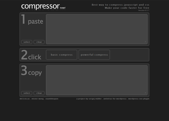
Compressor.Ebiene.de


Compress javascript and css. Amazing code compression. Quick easy and free

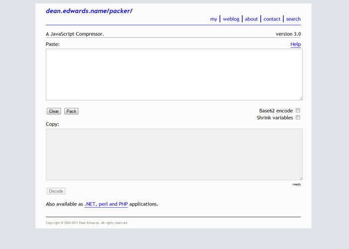
/packer/


packer

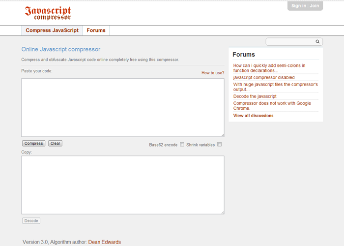
Javascript Compressor


Javascript Compressor   compress code online for free

CSS Compressor


CSS Compressor   Online code compressor for Cascading Style Sheets

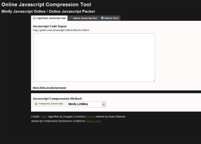
Minify/Pack Javascript Online


Minify Javascript Online   Online JavaScript Packer

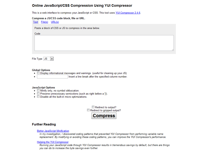
Online YUI Compressor


Online YUI Compressor

Performance Tools

There are few extensions/add-ons too using which you can check the performance of your website and suggests ways to improve the performance. One of them is YSlow by Yahoo, it has a Firefox Add-on as well as a Chrome Extension. There is one more web based tool Page Speed Online hosted at Google Labs, which is equally good. There is also a simple gzip test tool: GIDZipTest.

Conclusion

Our website’s performance is an important factor, and one of the main things in it is the website load time, if our websites are slow, there are chances that user won’t return. Also, these compression techniques are easily doable by editing the .htaccess file or by adding simple snippets using php or using those web based tools. Thus, you should definitely consider doing these tricks.