Sticky CSS Footer

Here’s how you should (or can) do a sticky CSS Footer.

Assuming the HTML looks something like this (and everything non footer is inside the “content” div)

<!DOCTYPE html>
<html>
<head>
  <title>Sticky Footer</title>
</head>
<body>
  <div class="content">&nbsp;</div>
  <footer>&copy; 2016</footer>
</body>
</html>

The easiest way to make the footer stick to the bottom would be to use some CSS like

body {
    margin: 0; /* If not already reset */
}

.content {
    min-height: calc(100vh - 20px);
}

footer {
    height: 20px;
}

This makes the “content” div take the minimum vertical height of the entire screen, minus 20 pixels (the fixed height of the footer).

Most of the search results when Googling “sticky CSS footer” are half a decade old, but this is how a sticky CSS footer should be easily implemented in 2016.

Ways to Build a Website

There are bunch of ways by which we can get a website up on the Internet. Each way has it’s merits and demerits. In this post I’ll share some ways which I think are fairly quick if you need a simple website up in minimal time. These ways are listed in the order of their coolness.

Static Website Template

If you don’t need anything fancy, then this is certainly the way to go. Just get a nice and pretty looking template from one of those template websites like Themeforest.

Pros

  1. Usually these templates are quite pretty.
  2. Several categories to chose from for templates (like restaurants, medical, etc).
  3. Come with stock/dummy content + images, which are easy to replace.
  4. Support is decent if you buy from a legitimate place.
  5. At times there are free templates too!

Cons

  1. You need to somewhat know your way around HTML/CSS. Otherwise the result won’t be very nice.
  2. Very generic templat-ey looking websites.
  3. Usually overloaded with a dozen varieties of galleries, sliders, etc, thus not efficient.
  4. Can be difficult to maintain if the number of pages in your website is not in single digits.

WordPress Website

I personally used to use WordPress for creating normal and just about every kind of website, and did so for couple of years until I realized how horrible that idea was. However, I believe this is still the most popular way to get static and dynamic websites up. I’m not saying the idea of using WordPress for normal websites is bad, just that I personally don’t like use things which are an overkill. WordPress is loaded and powerful, but do evaluate if you need all those features or not, and if using it is worth it. I use WordPress for this website because this place is essentially a blog only (and WordPress provides me with all the functionality I need).

Pros

  1. Everything from above, plus:
  2. You get a backend enabled website (CMS) fairly easily.
  3. Thus you can easily add or remove pages and maintain them too.
  4. Lots of plugins for quick functionality.
  5. Comes with blog! (duh)
  6. Most ideal for typical users.

Cons

  1. Everything from above (except 4), plus:
  2. The templates are not exactly flexible, it’s alright if you need to change the styling, but if you need to do structural stuff, you are better of creating your own template using something like underscores.me.
  3. I don’t like the file structure and code modularity of WordPress websites.
  4. Not very scalable (at least not neatly), although you can create bunch of plugins for doing bunch of stuff, but there is no central approach like present in other web frameworks.
  5. Most people usually tend to use several plugins and most many of these plugins will slow your website down.

Python/PHP Frameworks

If you kind of know your way around web development, then this is what you should probably do. There are bunch of awesome frameworks but top two (according to me) for a fairly functional website would Flask and Laravel (Python and PHP Web Frameworks). They both offer some great features like front end templates (Jinja2 and Blade) and are driven by things like template inheritance, etc. I know this may not be the most efficient solution for just a website, but it all depends upon your velocity. Personally I can more quickly and more neatly set up a website using Laravel than WordPress.

Pros

  1. Nice, clean and structured code base (because you authored most of it yourself).
  2. These frameworks typically have many modules/extensions which you use for a plethora of tasks (like ORMs for querying databases, form classes for HTML forms, etc).
  3. You write less code because of these already available modules/classes, and typically the building blocks behind these are pretty good.
  4. Because of these, your web site/application would typically be very easy to scale and maintain.

Cons

  1. You actually jumped to web development from web designing here.
  2. You need to be somewhat familiar with web development using Python or PHP.
  3. Maybe be an overkill for many people.

Website Builders

This is typically what people who have no idea about how to make websites do. They are usually offered from shared web hosting providers (like 1&1 Website Builder, etc) and are targeted towards users with no web design experience. There are also services which only do this, two most popular ones of this kind are Squarespace and Virb (owned by Media Temple (which is owned by GoDaddy)).

Pros

  1. Best option for people with no design experience.
  2. You can still end up with a decent looking website since they have a wide range of existing templates to chose from.
  3. Quite fast. It’s like using a rich text editor- for websites.

Cons

  1. Scalability and Flexibility? Lol.
  2. Not so much for customizations either.
  3. No matter what they advertise, but most of the websites which come out of tools like these don’t look very good.

Honorary Mentions

There are also tools like Concrete5 and Sitefinity CMS, in which case I think you would probably be better of with WordPress and also things like Expressions Engine and KendoUI, which I don’t really know what is and how they are better than their free counterparts.

7 Examples of Texture In Web Design

While the recent trend towards “flat” design emphasizes solid color blocks and clean lines, the ability to use texture effectively is still a necessary and powerful tool in the designer’s toolbox. Your use of texture can range from subtle to bold, from colorful to monochromatic, from a slight accent to a focal element  – there are virtually endless ways to use texture creatively in your designs. Texture can be used to add personality to your designs, produce a more immersive environment, and refine the visual experience.

Here are some examples of texture use to give you inspiration:

Jib

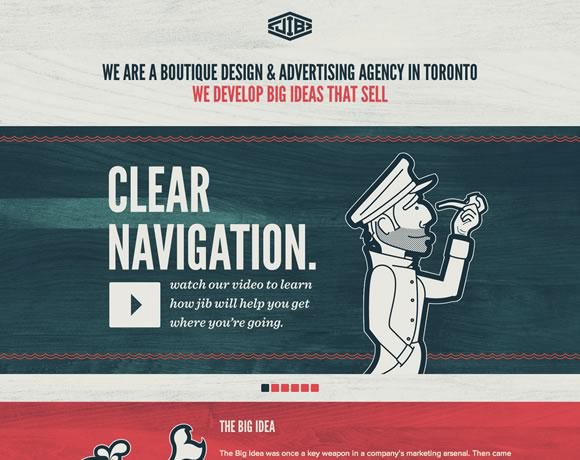
texture01Jib is a design and advertising agency based out of Toronto. Their homepage uses a light wood grain texture to give the site a slight retro feel. This little bit of texture is subtle, but it completely transforms the feel of the site, giving the visitor the impression of age and authority.

You’ll notice that the wood grain spreads across the entire background. While it can be risky using the same texture across an entire page, in this case it works well with the designer’s color choices. It should go without saying, but always pay attention to how your texture choices interact with other elements of your design.

Italiokitchen

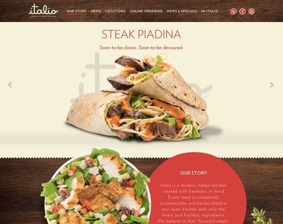
texture02Here’s another example of wood grain, but used as an accent instead rather than as a background texture for the entire page. The contrast of these two examples shows how important it is to consider context when deciding how you’re going to apply texture to your design. You can make nearly any textural element work, provided you keep in mind context.

Marc Thomas

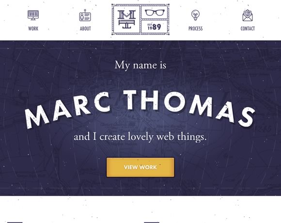
texture03Texture doesn’t have to be something subtle you use to subtly alter the look and feel of your site – it can be the focal point of your design. This splash page is pretty much just a name, background, and call to action button, but the texture is what makes it work.

Here the design is enhanced by the map in the background that functions as a textural backdrop, and the little dots that give the site an “old-school” movie projector feel.

Lab Fiftyfive

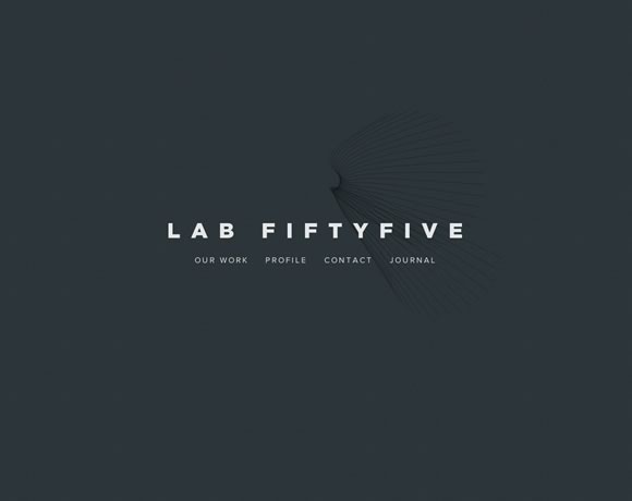
texture04This example shows how you can use abstract background elements to accent a simple design. The hint of texture in the background gives this simple business card style layout a much needed element of depth.

This site would also be a great illustration of the power of typography, but perhaps that’s a discussion for another time.

Mode 87

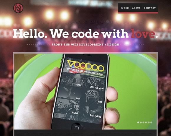
texture05The old “photo as a background” technique is often overused, but there are certainly times when it works well. Here, the background photo is blurred, turning it into a more abstract background than if it were clearly defined. The background blurring also drives focus to the foreground element, which also gives the viewer the impression that they’re at a concert, but completely focused on their phone.

While background images aren’t strictly considered “textures”, a background image to one designer might be applied like a textural element to another. Don’t be afraid to try things that are out of the box.

Arkleus

texture06The use of noise here transforms just another background photo into a something else entirely. Note how the combination of noise texture and dark colors here gives the site a mysterious feel – perfect for a launch site.

I Shot Him

texture07What about incorporating real life texture into your designs? Here’s a great reminder that texture isn’t a design “technique” – it’s a very real part of how we interact with our visual world. We’re surrounded by texture everywhere we look – but a great designer can manipulate that texture to create works of beauty, whether in the real or digital world.

It’s easy to get stuck in a design rut where you constantly go back to design elements that have worked for you in the past, but an important part of growing as a designer is to expand your comfort zone and continuously try new things. Hopefully these examples gave you a few new ideas of how you can incorporate texture into your own designs.

This guest article was written by Simon. He is currently working for Jangomail a cool provider.

A Guide to Future Proof Mobile/Tablet Friendly Websites

Tablet and Phones
In a matter of couple of years, more than half of total web browsing will be done from mobile devices, however, mobile devices don’t necessarily provide the same design implementation as desktop computers do and many of times we see our websites breaking on those small screens, while many designers create tablet/mobile specific website, but I think maintaining one website is better than maintaining two separate ones. Below I will discuss some importanr things which we can keep in mind while creating a website to make it future proof for mobile devices as well as desktop computers.

Use Responsive Frameworks

Responsive Web Design
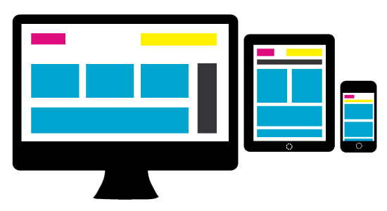
Getting back to the idea of two separate websites, I don’t think it pleases me or anyone much, we are better off doing one Responsive Website. Well, what is this Responsive Website exactly? Wikipedia defines Responsive Web Design as

Responsive Web Design (RWD) essentially indicates that a web site is crafted to use Cascading Style Sheets 3 media queries, an extension of the @media rule, with fluid proportion-based grids, to adapt the layout to the viewing environment, and probably also flexible images. Which means, having a responsive website enables us serve all devices via a single website, it enables us to address the ever-changing screen sizes, orientations and resolutions by using a flexible/fluid grid which will adapt to any screen size (and resolution). With responsive design, we have one website which serves all kinds of devices. This is in contrast from the other trend where we need to maintain at least two websites (desktop and mobile version). It has an obvious major advantage of far easier maintenance (now we maintain one instead of two websites). The essential concept of responsive design is minimum (or no) of resizing, scrolling (horizontal) and panning. There are many frameworks for fluid grids out there, I like the the 1140px CSS Grid and those who are loyal to 960px width can check out Gumby 960 CSS Framework.

Use Media Queries, everywhere

Media queries are certainly the most important part of responsive websites. Media queries were restricted in CSS2 to only screen, print and all, but, in CSS3 they are far more robust. We can now apply different stylesheets/styles based on the size of the viewport and pixel densities. Generally, for the most part, website implementation looks similar in tablets and desktops, however, many elements tend to get implemented (or displayed) differently in tablets, we can fix those elements using specific CSS thanks to media queries, also, we can differentiate how a particular element or the whole website will look in small screen phones, smart phones, tablets and desktops using media queries only. Here I am sharing some essential media queries.

Media Query for Normal Phones

We can include all of our phone specific styles within this block:

@media only screen and (min-device-width: 320px) and (max-device-width: 480px) {
    /* ==================================== */
    /* ! All phone specific CSS goes here */
    /* ==================================== */
}

Media Query for Smart Phones

The difference between a smartphone and a normal phone is resolution, smart phones will always higher resolution than normal phones, we can include all of our smart phone specific styles within this block:

@media handheld,
only screen and (max-width: 767px) {
    /* ========================================= */
    /* ! All smartphone specific CSS goes here */
    /* ========================================= */
}

Media Query for Tablets

We can use the below media query for all of our tablet specific styles, do keep in mind this will not get applied to those 10 inches tablets like Motorola Xoom, Toshiba Thrive, etc and will get applied to small/old monitors.

@media only screen and (min-device-width: 600px) and (max-device-width: 1024px) {
    /* ===================================== */
    /* ! All tablet specific CSS goes here */
    /* ===================================== */
}

Media Query for New Retina Displays

If we have some high resolutions assets which we will like to be applied to iPhone 4, iPhone 4S and iPad 3, then we can use the below block:

@media only screen and (-webkit-min-device-pixel-ratio: 2) {
    /* =================================== */
    /* ! Higher resolution CSS goes here */
    /* =================================== */
}

Taking Care of Orientation Problems As I discussed in my post:

Making Devices on Portrait Orientation Behave like Mobile, some websites get screwed in portrait orientation, read there only how it happens and why I strongly recommend to use the below media query.

@media handheld,
only screen and (max-width: 767px),
screen and (orientation: portrait) {
    /* ========================================================================= */
    /* ! All phone and tablets(in portrait orientation) specific CSS goes here */
    /* ========================================================================= */
}

Design Light and Fast Websites

Fast Websites
The CPU of a mobile device is not same as of a desktop computer, thus if we are using a lot of high resolution assets like images and videos, we should give it a second thought from the perspective of mobile devices, also, loading a lot of jQuery/JavaScript for animations and other effects will most likely deteriorate the performance of our website and the website will tend to hang frequently, to overcome this, make sure the website made is light weight and simple, a simple website is definitely a winner for mobile devices as it can also be used easily. Also, we should try reducing requests around network to minimum, some techniques for reducing HTTP requests include using CSS Sprites, combining (and compressing) multiple stylesheets/JavaScript files into one and using Data URI whenever possible. Data URIs are means to inline data in web pages, that is no external HTTP Request, here is one website to encode Data URIs. Back to JS, we should try and load all JavaScript in the end as it will increase the overall performance or at least we can use defer and async attributes (HTML5 only), furthermore, a lot of JS becomes useless for mobile device anyways, we should simply not load them by checking for user agent, here is JS snippet which pretty much checks for every mobile and tablet around:

var mobile = (/iphone|ipod|android|blackberry|opera mini|opera mobi|skyfire|maemo|windows|phone|palm|iemobile|symbian|symbianos|fennec/i.test(navigator.userAgent.toLowerCase()));
var tablet = (/ipad|android 3|sch-i800|playbook|tablet|kindle|gt-p1000|sgh-t849|shw-m180s|a510|a511|a100|dell|streak|silk/i.test(navigator.userAgent.toLowerCase()));
if (mobile) { /* JS for mobile devices */ } else if (tablet) { /* JS for tablets */ } else { /* JS for everything else */ }

This is not a 100% bullet proof method, but there is nothing to lose.

Dealing with Hardware

A4
One thing to remember while building mobile websites is that they don’t have any mouse or keyboard, so all keyboard jQuery for navigation will not work, also, since there is no mouse, there are no hover effects. Building navigation menu for tablets is little tricky, although most tablets like iPad make most of the navigation menus easily usable, however, in some tablets like PlayBook, making our navigation menu work is real pain, especially the ones with sub menus (since they use hover), we need to carefully CSS between :hover and :active pseudo classes (as they are practically same for mobile devices). Whitespacing is another crucial element in mobile devices, we don’t want our website to look in clutter and we must build elements, especially clickable elements with decent amount of padding **and adequate **spacing so that our fingers can tap easily on them (since our fingers are much more thicker than mouse pointers and some times it gets irking when we can not click items and need to zoom-in to do so). Besides, check out jQuery Mobile for adding touch gestures to websites.

Ditch Flash

Flash
Most of us are already aware of that many mobile devices like iPhones, iPads, Windows Phones, Chrome on Android, etc don’t have flash, even if some do, flash experience on them is not the same as in desktop computers, thus we should certainly not use it. We can use jQuery animation instead of flash to achieve most of the effects and where flash is absolutely necessary, we can do conditionals to check for flash and then execute the suitable code. SWFObject is an easy to use and standards friendly method to embed Flash content, which utilizes one small JavaScript file, we should use this where we absolutely need to use flash.

And finally, not all tablets are Webkit, use standardized properties!

Windows 8 Tablet
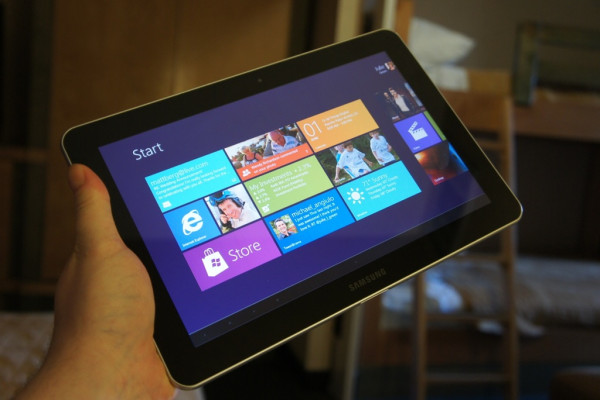
I know this will sound weird to most of you, especially since currently every tablet (probably) is on Webkit and thus what we tend to do is use those non standardized -webkit only CSS3 without their other counterparts, though it is very helpful and it works (and we should use them), but there are problems because of this, let me illustrate one. A decade ago, IE6 was the most dominant web browser in the world, the whole Internet was full of websites made only for IE6, the users of other browsers were discontented. Though that particular problem is over now, but it is back in another form now, Webkit. Webkit is the rendering engine used by almost every modern mobile device (except a very few) and hence the mobile Internet is now full of Webkit only websites, now what if in future tablets ditch Webkit? And that future might not be very distant, later this year, Microsoft will introduce its flagship for tablet operating system, Windows 8, and as far as I can tell from its release preview and beta, its quite good, and its success wont be any surprise, however, it will be a surprise for designers when most of their websites wont work on it’s default web browser. Similarly, Firefox and Opera also have a decent share of mobile browsing, those -webkit properties wont work on even them (although Opera supports some -webkit properties). So to avoid all this, we are better off using standardized CSS properties for most of our designing and use -webkit properties with their -moz, -ms, -o and prefixless counterparts. Prefixr.com can help you to make your cross-browser CSS.

Further Reading [unordered_list style=”arrow”]

Making Devices on Portrait Orientation Behave like Mobile

How many times it has happened that a website looks perfect on landscape but gets screwed up in portrait, this happens since some tablets return static width, that is they will continue to return the same width in both landscape and portrait orientation, while some tablets return the width according to their orientation. I will explain this with a real example, iPad (all three) will return 768px as their width in both landscape and portrait orientation, although it should return 1024px in landscape mode, now what happens is, the website works well in landscape mode, however, in portrait orientation, the screen’s viewport becomes much smaller and the most irking part is, the same default list of styles will continue to be applied to it (because of it returning the same width), and as a result the whole website becomes a clutter, while **PlayBook **returns 1024px as width in landscape orientation and 600px in portrait orientation, so as soon as you tilt it, you can see the phone specific media query gets applied, to fix this, we can rewrite our phone specific media query like below, what it does is checks iPad’s orientation and applies the same specific styles as those of smartphones if the iPad is in portrait orientation.

@media handheld,
only screen and (max-width: 767px),
screen and (orientation: portrait) {
    /* ! All phone and tablets(in portrait orientation) specific CSS goes here */
}

Disable textarea Resizing

Normally whenever we use textarea in pages, the browser allows the user to resize it, but at times this is not wanted(as it might screw the other aspects of the design). Here is how we can disable textarea resizing using basic CSS.

Old Method

In the old method, we needed to to specify the value of the CSS property of the

max-height/max-width same as height/width.

textarea { height:300px; width:400px; max-height:300px; max-width:400px; }

Though this method will work out well, but we still see that “resize” icon in corner.

New CSS3 Method

Hence, there is a better way to do this in CSS3. Instead of specifying the

max-height/max-width, we can simply mention resize: none.

textarea { height:300px; width:400px; resize:none; }

It works the same way, and this time without the “resize” icon in corner.

Optional/Conditional Resizing

For enabling only the horizontal resizing, we can replace the none with horizontal.

textarea { height:300px; width:400px; resize:horizontal; }

Similarly for enabling only the vertical resizing, we can replace the none with vertical.

textarea { height:300px; width:400px; resize:vertical; }

CSS3 Content Filter Using negation pseudo-class

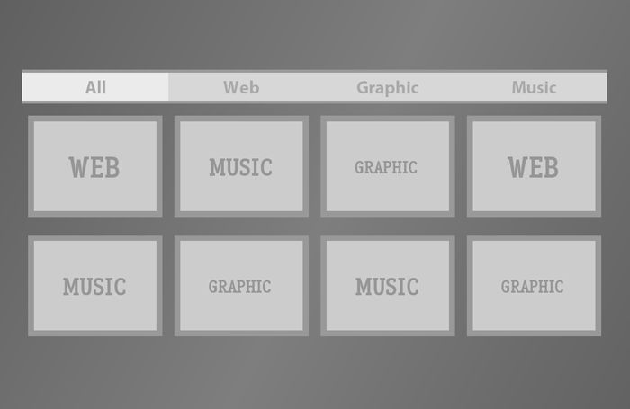
This tutorial shows how we filter content only by using CSS3 and then add some easing transitions to it. Content Filtering is done by CSS’ negation pseudo-class and the class attribute and the transitions are again by CSS only, there is no JavaScript/jQuery involved. You can see the code(s) below, download the full working file or check out a live demo. via vogtjosh.com

CSS3 Content Filter
Live Demo // Download

The Code

The CSS

body {
    width: 980px;
    margin-left: auto;
    margin-right: auto;
    font-family: "Myriad Pro", "Myriad Web", Myriad, Frutiger, Calibri, sans-serif, Arial Black, Gadget;
    overflow: hidden;
    background: #545454;
    background: -webkit-gradient(linear, left top, right bottom, from(#545454), color-stop(.5, #7e7e7e), to(#545454)) fixed;
    background: -webkit-linear-gradient(45deg, #545454, #7e7e7e .5, #545454);
    background: -moz-linear-gradient(45deg, #545454, #7e7e7e .5, #545454);
    background: -o-linear-gradient(45deg, #545454, #7e7e7e .5, #545454);
}
section {
    display: block;
    float: left;
    min-height: 450px;
    width: 100%;
}
a {
    display: block;
    float: left;
    width: 25%;
    text-decoration: none;
    text-align: center;
    padding: 5px 0;
    color: #a9a9a9;
    background: #d7d7d7;
    font-weight: bold;
    font-size: 30px;
    border-top: 5px solid #999;
    border-bottom: 5px solid #999
}
div {
    display: block;
    float: left;
    height: 150px;
    width: 205px;
    border: 10px solid #999;
    margin: 10px;
    -webkit-transition: all .85s linear;
    -moz-transition: all .85s linear;
    -o-transition: all .85s linear;
    -ms-transition: all .85s linear;
    transition: all .85s linear;
    margin-top: 20px;
}
div[class="web"] {
    background: url(images/web.jpg);
}
div[class="graphic"] {
    background: url(images/graphic.jpg);
}
div[class="music"] {
    background: url(images/music.jpg);
}
a:focus[class] {
    background: #ebebeb;
    outline: none;
}
a[class="web"]:focus ~ div:not([class="web"]) {
    height: 0px;
    width: 0px;
    border: none;
    margin: 0;
}
a[class="graphic"]:focus ~ div:not([class="graphic"]) {
    height: 0px;
    width: 0px;
    border: none;
    margin: 0;
}
a[class="music"]:focus ~ div:not([class="music"]) {
    height: 0px;
    width: 0px;
    border: none;
    margin: 0;
}

The HTML

<section>
    <a href="#" class="all" tabindex="-1">All</a> <a href="#" class="web" tabindex="-1">Web</a> <a href="#" class="graphic" tabindex="-1">Graphic</a> <a href="#" class="music" tabindex="-1">Music</a> 
    <div class="web"></div>
    <div class="music"></div>
    <div class="graphic"></div>
    <div class="web"></div>
    <div class="music"></div>
    <div class="graphic"></div>
    <div class="music"></div>
    <div class="graphic"></div>
</section>

Adding New Filters

Adding new filter is fairly easy, you can add as many filters as your want, add an anchor tag like below to the HTML Code.

<a href="#" class="FILTER" tabindex="-1">Filter Name</a>

With correspoing div for the Filter Content.

<div class="FILTER">
</div>

And add the CSS like below to the CSS Code.

a[class="FILTER"]:focus ~ div:not([class="FILTER"]) { height:0px; width:0px; border:none; margin:0; }

Where FILTER is the filter name, you will also need to change CSS of the layout if you intent to use the default file only.

Compatibility

For Working:

  • Firefox 3+
  • Safari 3+
  • Chrome (any)
  • Opera 10+
  • Internet Explorer 9+

For Transitions:

  • Firefox 4+
  • Safari 4+
  • Chrome 4+
  • Opera 10.5+

CSS3 Tabs with CSS3 Navigation Menu

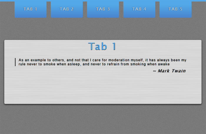
Whenever we think about tabs, we think about JavaScript. But tabs can be created using CSS only as well. Even the transitions can be achieved using CSS. These tabs behave like general JavaScript Tabs. I am using the Navigation Menu which I created a while ago, the navigation menu gives the ability to link to specific tabs through hash tags in the URL. CSS3 Tabs with CSS3 Navigation Menu

Live Demo // Download

The Code

The CSS

body {
    font-family: 'Lucida Sans Unicode', 'Lucida Grande', sans-serif;
    background: #545454;
    margin: 0;
    border-top: 7px solid #52a8e8;
    text-shadow: 0 0 3px rgba(0, 0, 0, 1);
    letter-spacing: 2px;
    font-size: 20px;
    background: #fff url(grain.png);
}
a {
    text-decoration: none;
    color: #fff;
}
header {
    width: 870px;
    margin-left: auto;
    margin-right: auto;
}
header nav a {
    position: relative;
    float: left;
    width: 150px;
    text-align: center;
    padding-top: 23px;
    padding-bottom: 30px;
    margin-right: 20px;
    -webkit-border-bottom-right-radius: 5px;
    -webkit-border-bottom-left-radius: 5px;
    -moz-border-radius-bottomright: 5px;
    -moz-border-radius-bottomleft: 5px;
    border-bottom-right-radius: 5px;
    border-bottom-left-radius: 5px;
    -webkit-transition: all .25s ease-out;
    -moz-transition: all .25s ease-out;
    -o-transition: all .25s ease-out;
    background: #52a8e8;
    background: -webkit-gradient(linear, left top, left bottom, color-stop(.2, #52a8e8), color-stop(1, #4984ce));
    background: -moz-linear-gradient(center top, #52a8e8 20%, #4984ce 100%);
    background: -o-linear-gradient(#52a8e8, #4984ce);
}
header nav a:hover {
    padding-top: 53px;
    padding-bottom: 60px;
    -webkit-transition: all .25s ease-out;
    -moz-transition: all .25s ease-out;
    -o-transition: all .25s ease-out;
}
h1 {
    clear: both;
    text-align: center;
    font-size: 45px;
}
blockquote {
    font: 16px normal helvetica, sans-serif;
    margin-top: 10px;
    margin-bottom: 10px;
    margin-left: 50px;
    padding-left: 15px;
    border-left: 3px solid #222;
    text-shadow: 0 0 2px rgba(0, 0, 0, 0.50);
}
.author {
    float: right;
    padding-right: 75px;
    text-shadow: 0 0 2px rgba(0, 0, 0, 0.50);
}
#box {
    margin: 150px auto;
    width: auto;
    text-align: left;
}
a {
    text-decoration: none;
}
ul {
    list-style: none;
}
#boxes {
    width: 925px;
    margin-left: auto;
    margin-right: auto;
    position: relative;
    min-height: auto;
}
.box:target,
.box:first-child {
    opacity: 1;
    -moz-opacity: 1;
}
.box {
    opacity: 0;
    -moz-opacity: 0;
    position: absolute;
    top: 0;
    left: 0;
    width: auto;
    -webkit-transition: all .5s;
    -moz-transition: all .5s;
    -o-transition: all .5s;
    transition: all .5s;
}
.box:target span {
    height: auto;
    width: auto;
    background: #fff;
    display: block;
    position: absolute;
    top: -32px;
    z-index: 0;
}
.box ul,
.box p {
    line-height: 1.5em;
    padding-top: 1em;
}
#boxes a {
    color: #52a8e8;
    text-shadow: 0 1px 1px rgba(0, 0, 0, 1);
}
.box li a {
    display: block;
    line-height: 2.2em;
    font-size: 14px;
    margin-bottom: 6px;
    padding-left: 10px;
}
#boxes ul li a:hover {
    color: #fff;
    font-weight: bold;
    text-decoration: none;
}
.container {
    height: 300px;
    width: 925px;
    margin-left: auto;
    margin-right: auto;
    background: #fff url(lines.png);
    -webkit-box-shadow: #131313 0px 2px 10px;
    -moz-box-shadow: #131313 0px 3px 10px;
    box-shadow: #131313 0px 3px 10px;
    -webkit-border-bottom-right-radius: 5px;
    -webkit-border-radius: 5px;
    -moz-border-radius: 5px;
    border-radius: 5px;
}

The HTML

<header>
    <nav> [TAB 1][1] [TAB 2][2] [TAB 3][3] [TAB 4][4] [TAB 5][5] </nav>
</header>
<div id="box">
    <ul id="boxes">
        <li id="1" class="box">
            <div class="container">
                <h1>
                    <a href="https://priteshgupta.com/" target="_blank">Tab 1</a>
                </h1>
                <blockquote>
                    As an example to others, and not that I care for moderation myself, it has always been my rule never to smoke when asleep, and never to refrain from smoking when awake <br />
                </blockquote>
                <em class="author">~ Mark Twain</em>
            </div>
            <span></span>
        </li>
        <li id="2" class="box">
            <div class="container">
                <h1>
                    <a href="https://priteshgupta.com/" target="_blank">Tab 2</a>
                </h1>
                <blockquote>
                    Anger is an acid that can do more harm to the vessel in which it is stored than to anything on which it is poured <br />
                </blockquote>
                <em class="author">~ Mark Twain</em>
            </div>
            <span></span>
        </li>
        <li id="3" class="box">
            <div class="container">
                <h1>
                    <a href="https://priteshgupta.com/" target="_blank">Tab 3</a>
                </h1>
                <blockquote>
                    A man's character may be learned from the adjectives which he habitually uses in conversation <br />
                </blockquote>
                <em class="author">~ Mark Twain</em>
            </div>
            <span></span>
        </li>
        <li id="4" class="box">
            <div class="container">
                <h1>
                    <a href="https://priteshgupta.com/" target="_blank">Tab 4</a>
                </h1>
                <blockquote>
                    Biographies are but the clothes and buttons of the man. The biography of the man himself cannot be written <br />
                </blockquote>
                <em class="author">~ Mark Twain</em>
            </div>
            <span></span>
        </li>
        <li id="5" class="box">
            <div class="container">
                <h1>
                    <a href="https://priteshgupta.com/" target="_blank">Tab 5</a>
                </h1>
                <blockquote>
                    But who prays for Satan? Who, in eighteen centuries, has had the common humanity to pray for the one sinner that needed it most? <br />
                </blockquote>
                <em class="author">~ Mark Twain</em>
            </div>
            <span></span>
        </li>
    </ul>
</div>

Adding New Tabs

Adding new tabs is really easy, you can add as many tabs as you want, just add another hyperlink within <strong><nav></strong> with the anchor link as the hash-tag that matches the ID of the Tab. And then, to add the Tab(Content), add something like:

<li id="ID" class="box">
    <div class="container">
        <h1><a href="https://priteshgupta.com/" target="_blank">Some Heading</a></h1>
        <blockquote>Biographies are but the clothes and buttons of the man. The biography of the man himself cannot be written <br> </blockquote>
        <em class="author">~ Mark Twain</em> 
    </div>
    <span></span> 
</li>

Within <ul id="boxes">, where ‘ID’ is is the ID of the Tab.

Compatibility

For Working:

  • Firefox 3+
  • Safari 3+
  • Chrome (any)
  • Opera 10+
  • Internet Explorer 9+

For Transitions:

  • Firefox 4+
  • Safari 4+
  • Chrome 4+
  • Opera 10.5+

Flip or Reverse Text Using CSS

As title says, we can Flip Text Upside Down or Reverse Text using CSS only(Rather than some jQuery Plugin or JavaScript). The CSS is completely Cross-browser compatible(Yeah, even older IEs), check out the CSS below.

Flipping Text Upside Down

-webkit-transform:rotate(-180deg);
-moz-transform:rotate(-180deg);
-o-transform:rotate(-180deg);
transform:rotate(-180deg);
ms-filter:"progid:DXImageTransform.Microsoft.BasicImage(rotation=2)";
filter:progid:DXImageTransform.Microsoft.BasicImage(rotation=2);

Reversing Text

direction: rtl;
unicode-bidi: bidi-override; 

Live Demo

Here is a live demo of implementation of above snippets:

Flipping Text

Reversing Text

Alternatively, you can see them here.

Stack of Papers Using CSS3 (With Ribbons and Animation)

I had earlier written how we could create Animated Navigation Menu using CSS3. Now, in this post I am going to show how we can create stack of papers effect using CSS3 and then how we can add animations and ribbons using CSS only.
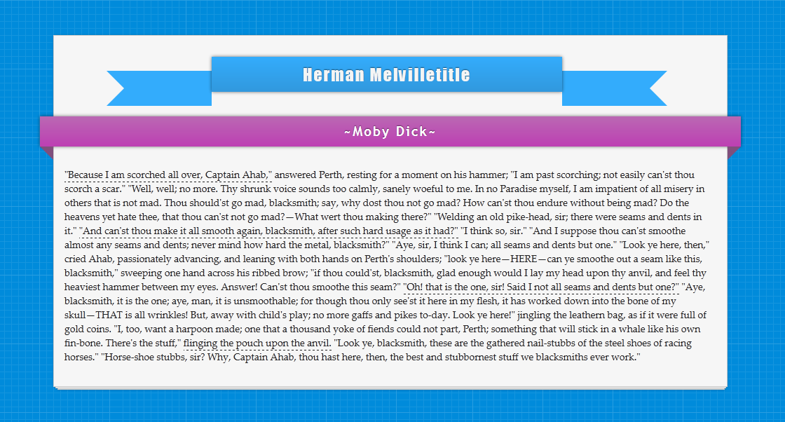
Stack of Papers Using CSS3

Live Demo // Download

Basic Stack of Papers
Basic Stack of Papers Using CSS3
Setting up basic stack of papers is easy, the code for it is below and you can see a live demo here.

The CSS

{code type=CSS}
body {
background: #333 url(http://priteshgupta.com/demos/papers/bg.png);
}
.stack {
background: #f6f6f6;
border: 1px solid #ccc;
height: 500px;
margin: 50px auto;
position: relative;
width: 960px;
-webkit-box-shadow: 0 0 3px hsla(0, 0%, 0%, .1);
-moz-box-shadow: 0 0 3px hsla(0, 0%, 0%, .1);
box-shadow: 0 0 3px hsla(0, 0%, 0%, .1);
}
.stack:after, .stack:before {
background: #f6f6f6;
border: 1px solid #ccc;
bottom: -3px;
content: ”;
height: 500px;
left: 2px;
position: absolute;
width: 955px;
z-index: -10;
-webkit-box-shadow: 0 0 3px hsla(0, 0%, 0%, .2);
-moz-box-shadow: 0 0 3px hsla(0, 0%, 0%, .2);
box-shadow: 0 0 3px hsla(0, 0%, 0%, .2);
}
.stack:before {
bottom: -5px;
left: 5px;
width: 950px;
}
{/code}

The HTML

{code type=HTML}


{/code}
However, if you will like more than three stack of papers, use the below CSS and see a live demo here.
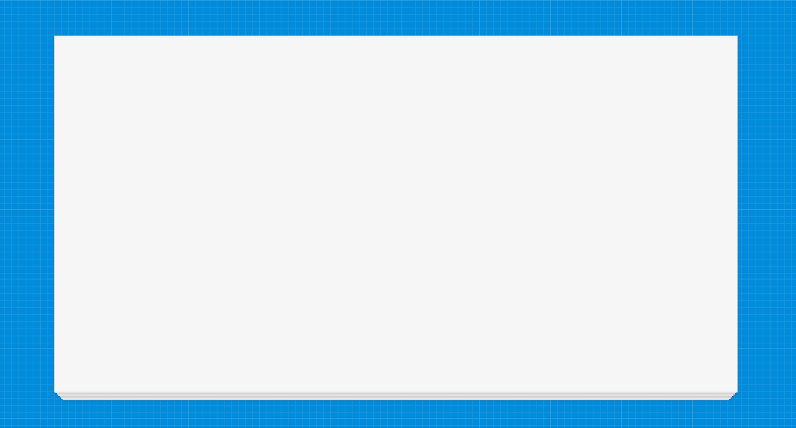
Stack of Papers Using CSS3
{code type=CSS}
body {
background: #333 url(http://priteshgupta.com/demos/papers/bg.png);
}
.stack {
background: #f6f6f6;
border: 1px solid #ccc;
height: 500px;
margin: 50px auto;
width: 960px;
-webkit-box-shadow: 0 0 0 hsla(0, 0%, 0%, .5), 0 3px 0 -2px #f6f6f6, 0 3px 2px -2px hsla(0, 0%, 0%, .4), 0 7px 0 -4px #f6f6f6, 0 7px 2px -4px hsla(0, 0%, 0%, .4), 0 11px 0 -6px #f6f6f6, 0 11px 2px -6px hsla(0, 0%, 0%, .4), 0 15px 0 -8px #f6f6f6, 0 15px 2px -8px hsla(0, 0%, 0%, .4), 0 19px 0 -10px #f6f6f6, 0 19px 2px -10px hsla(0, 0%, 0%, .4), 0 23px 0 -12px #f6f6f6, 0 23px 2px -12px hsla(0, 0%, 0%, .4);
-moz-box-shadow: 0 0 0 hsla(0, 0%, 0%, .5), 0 3px 0 -2px #f6f6f6, 0 3px 2px -2px hsla(0, 0%, 0%, .4), 0 7px 0 -4px #f6f6f6, 0 7px 2px -4px hsla(0, 0%, 0%, .4), 0 11px 0 -6px #f6f6f6, 0 11px 2px -6px hsla(0, 0%, 0%, .4), 0 15px 0 -8px #f6f6f6, 0 15px 2px -8px hsla(0, 0%, 0%, .4), 0 19px 0 -10px #f6f6f6, 0 19px 2px -10px hsla(0, 0%, 0%, .4), 0 23px 0 -12px #f6f6f6, 0 23px 2px -12px hsla(0, 0%, 0%, .4);
box-shadow: 0 0 0 hsla(0, 0%, 0%, .5), 0 3px 0 -2px #f6f6f6, 0 3px 2px -2px hsla(0, 0%, 0%, .4), 0 7px 0 -4px #f6f6f6, 0 7px 2px -4px hsla(0, 0%, 0%, .4), 0 11px 0 -6px #f6f6f6, 0 11px 2px -6px hsla(0, 0%, 0%, .4), 0 15px 0 -8px #f6f6f6, 0 15px 2px -8px hsla(0, 0%, 0%, .4), 0 19px 0 -10px #f6f6f6, 0 19px 2px -10px hsla(0, 0%, 0%, .4), 0 23px 0 -12px #f6f6f6, 0 23px 2px -12px hsla(0, 0%, 0%, .4);
}
{/code}

Animating Stack of Papers
Stack of Papers Using CSS3
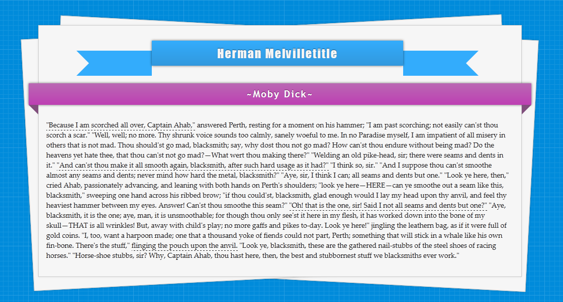
Now, I have added some content in it along with two CSS Ribbons and a simple animation to spread the stack of papers, though the easing animation is only available in Firefox(Since it only supports transition tags with Pseudo-elements). This is the final version, you can see a live demo here.

The CSS

{code type=CSS}
body {
background: #333 url(http://priteshgupta.com/demos/papers/bg.png);
font-family: ‘Palatino Linotype’, ‘Book Antiqua’, Palatino, serif;
}
p {
margin: 15px;
font-size: 14px;
font-family: ‘Palatino Linotype’, ‘Book Antiqua’, Palatino, serif;
color: #222;
position: relative;
float: left;
}
.stack {
background: #f6f6f6;
border: 1px solid #ccc;
height: 500px;
margin: 50px auto;
position: relative;
width: 960px;
-webkit-box-shadow: 0 0 3px hsla(0, 0%, 0%, .1);
-moz-box-shadow: 0 0 3px hsla(0, 0%, 0%, .1);
box-shadow: 0 0 3px hsla(0, 0%, 0%, .1);
}
.stack:after, .stack:before {
background: #f6f6f6;
border: 1px solid #ccc;
bottom: -3px;
content: ”;
height: 500px;
left: 2px;
position: absolute;
width: 955px;
z-index: -10;
-webkit-box-shadow: 0 0 3px hsla(0, 0%, 0%, .2);
-moz-box-shadow: 0 0 3px hsla(0, 0%, 0%, .2);
box-shadow: 0 0 3px hsla(0, 0%, 0%, .2);
-webkit-transition: all .5s ease-out;
-moz-transition: all .5s ease-out;
-o-transition: all .5s ease-out;
}
.stack:before {
bottom: -5px;
left: 5px;
width: 950px;
}
.stack:hover:after {
-webkit-transform: rotate(-3deg) translate(-25px, 0);
-moz-transform: rotate(-3deg) translate(-25px, 0);
-ms-transform: rotate(-3deg) translate(-25px, 0);
-o-transform: rotate(-3deg) translate(-25px, 0);
transform: rotate(-3deg) translate(-25px, 0);
-webkit-transition: all .5s ease-out;
-moz-transition: all .5s ease-out;
-o-transition: all .5s ease-out;
}
.stack:hover:before {
-webkit-transform: rotate(3deg) translate(25px, 0);
-moz-transform: rotate(3deg) translate(25px, 0);
-ms-transform: rotate(3deg) translate(25px, 0);
-o-transform: rotate(3deg) translate(25px, 0);
transform: rotate(3deg) translate(25px, 0);
-webkit-transition: all .5s ease-out;
-moz-transition: all .5s ease-out;
-o-transition: all .5s ease-out;
}
#main {
font-family: Impact, Charcoal, sans-serif;
letter-spacing: 2px;
margin-left:75px;
margin-top: 50px;
text-shadow: 0 -1px 1px hsla(0, 0%, 0%, .5);
}
#menu {
background: #33acfc;
width: 500px;
height: 50px;
color: #F5F5F5;
font-size: 24px;
text-align: center;
position: relative;
top: -20px;
background-image: -webkit-gradient(linear, left top, left bottom, from(#33acfc), to(#3198dd));
background-image: -moz-linear-gradient(top, #33acfc, #3198dd);
background-image: -o-linear-gradient(top, #33acfc, #3198dd);
-moz-box-shadow: 0px 0px 4px rgba(0, 0, 0, 0.55);
-webkit-box-shadow: 0px 0px 4px rgba(0, 0, 0, 0.55);
box-shadow: 0px 0px 4px rgba(0, 0, 0, 0.55);
}
#menu span {
position: relative;
top: 10px;
}
.cont {
background: #33acfc;
width: 100px;
height: 50px;
}
.edge-right {
border-color: #33acfc transparent #33acfc #33acfc;
border-style:solid;
border-width:25px;
width: 0;
height: 0;
position: relative;
}
.edge-left {
border-color: #33acfc #33acfc #33acfc transparent;
border-style:solid;
border-width:25px;
width: 0;
height: 0;
position: relative;
}
.left {
float: left;
}
.right {
float: right;
}
.ribbon {
width: 980px;
font-size: 19px;
font-family: ‘Trebuchet MS’, Helvetica, sans-serif;
letter-spacing: 2px;
text-shadow: 0 -1px 1px hsla(0, 0%, 0%, .5);
position: relative;
background: #ba89b6;
color:#FFF;
text-align: center;
padding: 10px;
margin-left: -20px;
-moz-box-shadow: 0px 0px 4px rgba(0, 0, 0, 0.55);
-webkit-box-shadow: 0px 0px 4px rgba(0, 0, 0, 0.55);
box-shadow: 0px 0px 4px rgba(0, 0, 0, 0.55);
background-image: -webkit-gradient(linear, left top, left bottom, from(#ba68b3), to(#bd3fb3));
background-image: -moz-linear-gradient(top, #ba68b3, #bd3fb3);
background-image: -o-linear-gradient(top, #ba68b3, #bd3fb3);
}
.ribbon .ribbon-content:before, .ribbon .ribbon-content:after {
content: “”;
position: absolute;
display: block;
border-style: solid;
border-color: #804f7c transparent transparent transparent;
bottom: -1em;
}
.ribbon .ribbon-content:before {
left: 0;
border-width: 1em 0 0 1em;
}
.ribbon .ribbon-content:after {
right: 0;
border-width: 1em 1em 0 0;
}
a {
text-decoration:none;
color: inherit;
border-bottom: dashed 1px #222;
-webkit-transition: all 1s ease-out;
-moz-transition: all 1s ease-out;
-o-transition: all 1s ease-out;
}
a:hover {
background:rgba(51, 172, 252, 0.35);
-webkit-transition: all 1s ease-out;
-moz-transition: all 1s ease-out;
-o-transition: all 1s ease-out;
}
{/code}