7 Examples of Texture In Web Design

While the recent trend towards “flat” design emphasizes solid color blocks and clean lines, the ability to use texture effectively is still a necessary and powerful tool in the designer’s toolbox. Your use of texture can range from subtle to bold, from colorful to monochromatic, from a slight accent to a focal element  – there are virtually endless ways to use texture creatively in your designs. Texture can be used to add personality to your designs, produce a more immersive environment, and refine the visual experience.

Here are some examples of texture use to give you inspiration:

Jib

texture01Jib is a design and advertising agency based out of Toronto. Their homepage uses a light wood grain texture to give the site a slight retro feel. This little bit of texture is subtle, but it completely transforms the feel of the site, giving the visitor the impression of age and authority.

You’ll notice that the wood grain spreads across the entire background. While it can be risky using the same texture across an entire page, in this case it works well with the designer’s color choices. It should go without saying, but always pay attention to how your texture choices interact with other elements of your design.

Italiokitchen

texture02Here’s another example of wood grain, but used as an accent instead rather than as a background texture for the entire page. The contrast of these two examples shows how important it is to consider context when deciding how you’re going to apply texture to your design. You can make nearly any textural element work, provided you keep in mind context.

Marc Thomas

texture03Texture doesn’t have to be something subtle you use to subtly alter the look and feel of your site – it can be the focal point of your design. This splash page is pretty much just a name, background, and call to action button, but the texture is what makes it work.

Here the design is enhanced by the map in the background that functions as a textural backdrop, and the little dots that give the site an “old-school” movie projector feel.

Lab Fiftyfive

texture04This example shows how you can use abstract background elements to accent a simple design. The hint of texture in the background gives this simple business card style layout a much needed element of depth.

This site would also be a great illustration of the power of typography, but perhaps that’s a discussion for another time.

Mode 87

texture05The old “photo as a background” technique is often overused, but there are certainly times when it works well. Here, the background photo is blurred, turning it into a more abstract background than if it were clearly defined. The background blurring also drives focus to the foreground element, which also gives the viewer the impression that they’re at a concert, but completely focused on their phone.

While background images aren’t strictly considered “textures”, a background image to one designer might be applied like a textural element to another. Don’t be afraid to try things that are out of the box.

Arkleus

texture06The use of noise here transforms just another background photo into a something else entirely. Note how the combination of noise texture and dark colors here gives the site a mysterious feel – perfect for a launch site.

I Shot Him

texture07What about incorporating real life texture into your designs? Here’s a great reminder that texture isn’t a design “technique” – it’s a very real part of how we interact with our visual world. We’re surrounded by texture everywhere we look – but a great designer can manipulate that texture to create works of beauty, whether in the real or digital world.

It’s easy to get stuck in a design rut where you constantly go back to design elements that have worked for you in the past, but an important part of growing as a designer is to expand your comfort zone and continuously try new things. Hopefully these examples gave you a few new ideas of how you can incorporate texture into your own designs.

This guest article was written by Simon. He is currently working for Jangomail a cool provider.

A Guide to Future Proof Mobile/Tablet Friendly Websites

Tablet and Phones
In a matter of couple of years, more than half of total web browsing will be done from mobile devices, however, mobile devices don’t necessarily provide the same design implementation as desktop computers do and many of times we see our websites breaking on those small screens, while many designers create tablet/mobile specific website, but I think maintaining one website is better than maintaining two separate ones. Below I will discuss some importanr things which we can keep in mind while creating a website to make it future proof for mobile devices as well as desktop computers.

Use Responsive Frameworks

Responsive Web Design
Getting back to the idea of two separate websites, I don’t think it pleases me or anyone much, we are better off doing one Responsive Website. Well, what is this Responsive Website exactly? Wikipedia defines Responsive Web Design as

Responsive Web Design (RWD) essentially indicates that a web site is crafted to use Cascading Style Sheets 3 media queries, an extension of the @media rule, with fluid proportion-based grids, to adapt the layout to the viewing environment, and probably also flexible images. Which means, having a responsive website enables us serve all devices via a single website, it enables us to address the ever-changing screen sizes, orientations and resolutions by using a flexible/fluid grid which will adapt to any screen size (and resolution). With responsive design, we have one website which serves all kinds of devices. This is in contrast from the other trend where we need to maintain at least two websites (desktop and mobile version). It has an obvious major advantage of far easier maintenance (now we maintain one instead of two websites). The essential concept of responsive design is minimum (or no) of resizing, scrolling (horizontal) and panning. There are many frameworks for fluid grids out there, I like the the 1140px CSS Grid and those who are loyal to 960px width can check out Gumby 960 CSS Framework.

Use Media Queries, everywhere

Media queries are certainly the most important part of responsive websites. Media queries were restricted in CSS2 to only screen, print and all, but, in CSS3 they are far more robust. We can now apply different stylesheets/styles based on the size of the viewport and pixel densities. Generally, for the most part, website implementation looks similar in tablets and desktops, however, many elements tend to get implemented (or displayed) differently in tablets, we can fix those elements using specific CSS thanks to media queries, also, we can differentiate how a particular element or the whole website will look in small screen phones, smart phones, tablets and desktops using media queries only. Here I am sharing some essential media queries.

Media Query for Normal Phones

We can include all of our phone specific styles within this block:

@media only screen and (min-device-width: 320px) and (max-device-width: 480px) {
    /* ==================================== */
    /* ! All phone specific CSS goes here */
    /* ==================================== */
}

Media Query for Smart Phones

The difference between a smartphone and a normal phone is resolution, smart phones will always higher resolution than normal phones, we can include all of our smart phone specific styles within this block:

@media handheld,
only screen and (max-width: 767px) {
    /* ========================================= */
    /* ! All smartphone specific CSS goes here */
    /* ========================================= */
}

Media Query for Tablets

We can use the below media query for all of our tablet specific styles, do keep in mind this will not get applied to those 10 inches tablets like Motorola Xoom, Toshiba Thrive, etc and will get applied to small/old monitors.

@media only screen and (min-device-width: 600px) and (max-device-width: 1024px) {
    /* ===================================== */
    /* ! All tablet specific CSS goes here */
    /* ===================================== */
}

Media Query for New Retina Displays

If we have some high resolutions assets which we will like to be applied to iPhone 4, iPhone 4S and iPad 3, then we can use the below block:

@media only screen and (-webkit-min-device-pixel-ratio: 2) {
    /* =================================== */
    /* ! Higher resolution CSS goes here */
    /* =================================== */
}

Taking Care of Orientation Problems As I discussed in my post:

Making Devices on Portrait Orientation Behave like Mobile, some websites get screwed in portrait orientation, read there only how it happens and why I strongly recommend to use the below media query.

@media handheld,
only screen and (max-width: 767px),
screen and (orientation: portrait) {
    /* ========================================================================= */
    /* ! All phone and tablets(in portrait orientation) specific CSS goes here */
    /* ========================================================================= */
}

Design Light and Fast Websites

Fast Websites
The CPU of a mobile device is not same as of a desktop computer, thus if we are using a lot of high resolution assets like images and videos, we should give it a second thought from the perspective of mobile devices, also, loading a lot of jQuery/JavaScript for animations and other effects will most likely deteriorate the performance of our website and the website will tend to hang frequently, to overcome this, make sure the website made is light weight and simple, a simple website is definitely a winner for mobile devices as it can also be used easily. Also, we should try reducing requests around network to minimum, some techniques for reducing HTTP requests include using CSS Sprites, combining (and compressing) multiple stylesheets/JavaScript files into one and using Data URI whenever possible. Data URIs are means to inline data in web pages, that is no external HTTP Request, here is one website to encode Data URIs. Back to JS, we should try and load all JavaScript in the end as it will increase the overall performance or at least we can use defer and async attributes (HTML5 only), furthermore, a lot of JS becomes useless for mobile device anyways, we should simply not load them by checking for user agent, here is JS snippet which pretty much checks for every mobile and tablet around:

var mobile = (/iphone|ipod|android|blackberry|opera mini|opera mobi|skyfire|maemo|windows|phone|palm|iemobile|symbian|symbianos|fennec/i.test(navigator.userAgent.toLowerCase()));
var tablet = (/ipad|android 3|sch-i800|playbook|tablet|kindle|gt-p1000|sgh-t849|shw-m180s|a510|a511|a100|dell|streak|silk/i.test(navigator.userAgent.toLowerCase()));
if (mobile) { /* JS for mobile devices */ } else if (tablet) { /* JS for tablets */ } else { /* JS for everything else */ }

This is not a 100% bullet proof method, but there is nothing to lose.

Dealing with Hardware

A4
One thing to remember while building mobile websites is that they don’t have any mouse or keyboard, so all keyboard jQuery for navigation will not work, also, since there is no mouse, there are no hover effects. Building navigation menu for tablets is little tricky, although most tablets like iPad make most of the navigation menus easily usable, however, in some tablets like PlayBook, making our navigation menu work is real pain, especially the ones with sub menus (since they use hover), we need to carefully CSS between :hover and :active pseudo classes (as they are practically same for mobile devices). Whitespacing is another crucial element in mobile devices, we don’t want our website to look in clutter and we must build elements, especially clickable elements with decent amount of padding **and adequate **spacing so that our fingers can tap easily on them (since our fingers are much more thicker than mouse pointers and some times it gets irking when we can not click items and need to zoom-in to do so). Besides, check out jQuery Mobile for adding touch gestures to websites.

Ditch Flash

Flash
Most of us are already aware of that many mobile devices like iPhones, iPads, Windows Phones, Chrome on Android, etc don’t have flash, even if some do, flash experience on them is not the same as in desktop computers, thus we should certainly not use it. We can use jQuery animation instead of flash to achieve most of the effects and where flash is absolutely necessary, we can do conditionals to check for flash and then execute the suitable code. SWFObject is an easy to use and standards friendly method to embed Flash content, which utilizes one small JavaScript file, we should use this where we absolutely need to use flash.

And finally, not all tablets are Webkit, use standardized properties!

Windows 8 Tablet
I know this will sound weird to most of you, especially since currently every tablet (probably) is on Webkit and thus what we tend to do is use those non standardized -webkit only CSS3 without their other counterparts, though it is very helpful and it works (and we should use them), but there are problems because of this, let me illustrate one. A decade ago, IE6 was the most dominant web browser in the world, the whole Internet was full of websites made only for IE6, the users of other browsers were discontented. Though that particular problem is over now, but it is back in another form now, Webkit. Webkit is the rendering engine used by almost every modern mobile device (except a very few) and hence the mobile Internet is now full of Webkit only websites, now what if in future tablets ditch Webkit? And that future might not be very distant, later this year, Microsoft will introduce its flagship for tablet operating system, Windows 8, and as far as I can tell from its release preview and beta, its quite good, and its success wont be any surprise, however, it will be a surprise for designers when most of their websites wont work on it’s default web browser. Similarly, Firefox and Opera also have a decent share of mobile browsing, those -webkit properties wont work on even them (although Opera supports some -webkit properties). So to avoid all this, we are better off using standardized CSS properties for most of our designing and use -webkit properties with their -moz, -ms, -o and prefixless counterparts. Prefixr.com can help you to make your cross-browser CSS.

Further Reading [unordered_list style=”arrow”]

Best .htaccess Hacks for WordPress

I previously wrote Best .htaccess Hacks For Websites, now this article has .htaccess hacks pertaining to WordPress only. .htaccess is a configuration file on your server which controls Apache Server and is a very powerful tool for your website if used properly. Here are some .htaccess snippets which will surely help you improve your WordPress installation.

Please backup your .htaccess file before doing any changes. In case anything goes unexpected just replace the .htaccess with your backup.

Redirect WordPress Feed to FeedBurner

This simple snippet will redirect your default WordPress feed to your Feedburner, easy yea?

RewriteEngine on
RewriteCond %{HTTP_USER_AGENT} !FeedBurner    [NC]
RewriteCond %{HTTP_USER_AGENT} !FeedValidator [NC]
RewriteRule ^feed/?([_0-9a-z-]+)?/?$ http://feeds.feedburner.com/yourfeed [R=302,NC,L]

Simpler Login URL

A single line of code .htaccess can give you a better login experience, now you will just need to go to http://www.example.com/login instead of http://www.example.com/wp-login.php

RewriteRule ^login$ http://www.example.com/wp-login.php [NC,L]

Protect WordPress Blog from Script Injections

This snippet will protect your WordPress from malicious script injections.

Options +FollowSymLinks
RewriteEngine On
RewriteCond %{QUERY_STRING} (\<|%3C).*script.*(\>|%3E) [NC,OR]
RewriteCond %{QUERY_STRING} GLOBALS(=|\[|\%[0-9A-Z]{0,2}) [OR]
RewriteCond %{QUERY_STRING} _REQUEST(=|\[|\%[0-9A-Z]{0,2})
RewriteRule ^(.*)$ index.php [F,L]

Remove /category/ from your WordPress URL

This will transform http://www.example.com/category/post to http://www.example.com/post.

RewriteRule ^category/(.+)$ http://www.example.com/$1 [R=301,L]

Redirect Day and Name Permalinks to /%postname%/

If you have recently moved from day and name permalink structure to only post name structure, then use this snippet to redirect all backlinks.

RedirectMatch 301 /([0-9]+)/([0-9]+)/([0-9]+)/(.*)$ http://www.example.com/$4

Allow only particular IP address to wp-admin directory

If your blog is only managed by you and you have a static IP, then you can use this snippet to make the admin panel accessible only to your IP address.

AuthUserFile /dev/null
AuthGroupFile /dev/null
AuthName "Example Access Control"
AuthType Basic

order allow, deny
deny from all
allow from xx.xx.xx.xx

Protect your WordPress from Hotlinking

Wanna save bandwidth by not serving to other websites? Try the below snippet.

RewriteEngine On
RewriteCond %{HTTP_REFERER} !^http://(.+\.)?example\.com/ [NC]
RewriteCond %{HTTP_REFERER} !^$
RewriteRule .*\.(jpe?g|gif|bmp|png)$ /images/nohotlink.jpg [L]

Making Devices on Portrait Orientation Behave like Mobile

How many times it has happened that a website looks perfect on landscape but gets screwed up in portrait, this happens since some tablets return static width, that is they will continue to return the same width in both landscape and portrait orientation, while some tablets return the width according to their orientation. I will explain this with a real example, iPad (all three) will return 768px as their width in both landscape and portrait orientation, although it should return 1024px in landscape mode, now what happens is, the website works well in landscape mode, however, in portrait orientation, the screen’s viewport becomes much smaller and the most irking part is, the same default list of styles will continue to be applied to it (because of it returning the same width), and as a result the whole website becomes a clutter, while **PlayBook **returns 1024px as width in landscape orientation and 600px in portrait orientation, so as soon as you tilt it, you can see the phone specific media query gets applied, to fix this, we can rewrite our phone specific media query like below, what it does is checks iPad’s orientation and applies the same specific styles as those of smartphones if the iPad is in portrait orientation.

@media handheld,
only screen and (max-width: 767px),
screen and (orientation: portrait) {
    /* ! All phone and tablets(in portrait orientation) specific CSS goes here */
}

Disable textarea Resizing

Normally whenever we use textarea in pages, the browser allows the user to resize it, but at times this is not wanted(as it might screw the other aspects of the design). Here is how we can disable textarea resizing using basic CSS.

Old Method

In the old method, we needed to to specify the value of the CSS property of the

max-height/max-width same as height/width.

textarea { height:300px; width:400px; max-height:300px; max-width:400px; }

Though this method will work out well, but we still see that “resize” icon in corner.

New CSS3 Method

Hence, there is a better way to do this in CSS3. Instead of specifying the

max-height/max-width, we can simply mention resize: none.

textarea { height:300px; width:400px; resize:none; }

It works the same way, and this time without the “resize” icon in corner.

Optional/Conditional Resizing

For enabling only the horizontal resizing, we can replace the none with horizontal.

textarea { height:300px; width:400px; resize:horizontal; }

Similarly for enabling only the vertical resizing, we can replace the none with vertical.

textarea { height:300px; width:400px; resize:vertical; }

Flip or Reverse Text Using CSS

As title says, we can Flip Text Upside Down or Reverse Text using CSS only(Rather than some jQuery Plugin or JavaScript). The CSS is completely Cross-browser compatible(Yeah, even older IEs), check out the CSS below.

Flipping Text Upside Down

-webkit-transform:rotate(-180deg);
-moz-transform:rotate(-180deg);
-o-transform:rotate(-180deg);
transform:rotate(-180deg);
ms-filter:"progid:DXImageTransform.Microsoft.BasicImage(rotation=2)";
filter:progid:DXImageTransform.Microsoft.BasicImage(rotation=2);

Reversing Text

direction: rtl;
unicode-bidi: bidi-override; 

Live Demo

Here is a live demo of implementation of above snippets:

Flipping Text

Reversing Text

Alternatively, you can see them here.

Advanced Image Functions using PHP

Here are some PHP Functions for Images which I came across recently, these come under GD and Image Functions and require GD library. I have taken most of these from PHP Manual and they are quite helpful.

Sharpening All Images

function imagesharpen($image) {
    $matrix = array(array(-1, -1, -1), array(-1, 16, -1), array(-1, -1, -1), );
    $divisor = array_sum(array_map('array_sum', $matrix));
    $offset = 0;
    imageconvolution($image, $matrix, $divisor, $offset);
    return $image;
}

Sharpening Images via Function

<?php
function GDThrowError($message) { 
    // don't throw plain text errors in a function that's supposed to return an image 
    // as per "the principle of least astonishment": the user is expecting 
    // a jpeg, and they'll be less astonished to get a JPEG error message 
    // than they would be if they got plain text.  Imagine this was called 
    // from an image tag, which makes sense, that's how you use images: 
    // plain text errors won't even reach most users, they'd have to copy 
    // the img src into the address bar.  It probably wont' even occur to 
    // them, as it's not typically helpful to view the source of an image 
    // resource. 
    $font = 2; 
    // create a canvas with a bit of padding 
    $errimg = imagecreate((imagefontwidth($font) * strlen($message)) + 20, imagefontheight($font) + 10); 
    $bg = imagecolorallocate($errimg, 255, 255, 255); 
    $textcol = imagecolorallocate($errimg, 0, 0, 0); 
    imagestring($errimg, 2, 10, 5, $message, $textcol); 
    header('Content-type: image/jpeg');  
    imagejpeg($errimg); 
    imagedestroy($errimg); 
} 

function GDMakeJpegLookLikeCrap($target) { 
    // image dimensions are no longer needed (see below), but getimagesize can do some simple validation 
    if (($dims = @getimagesize($target)) === false || $dims['mime'] != 'image/jpeg') 
    { 
        GDThrowError('The file you specified couldn\'t be found or is not a valid jpeg image.  Make sure you spelled it correctly and provided the correct path.'); 
       return(false); 
    } 
    // the original function creates a new image and resamples the source to it using the same height and width here. 
    // I imagine this was to add future resizing functionality but as it is it does nothing but waste resources 
    $image = imagecreatefromjpeg($target); 
    // don't really know/care what this is.  If you're interested see http://us2.php.net/imageconvolution         
    // try tweaking these three vars for different effects, but there is a sharpening function in the php docs (above links) and it's not a trivial operation 
    $spnMatrix = array( array(-1,-1,-1,), 
                        array(-1,16,-1,), 
                        array(-1,-1,-1));  
    $divisor = 8;  
    $offset = 0;  
    imageconvolution($image, $spnMatrix, $divisor, $offset);  
    // I like to send headers as late as possible to avoid already sent errors and duplicate header content 
    header('Content-type: image/jpeg');  
    imagejpeg($image, null, 100);  
    imagedestroy($image);   
} 

// example call 
$s_image = (isset($_GET['image'])) ? $_GET['image'] : null; 

if (preg_match('/\.(jpg|jpeg)$/i', $s_image)) { 
    GDMakeJpegLookLikeCrap($s_image);   
} else { 
    GDThrowError('Please specify a jpeg file to sharpen in the form: ' . $_SERVER['PHP_SELF'] . '?image=filename.jpg'); 
} 
?>

Convert Image To PGM/Grayscale

<?php
function imagepgm($image, $filename = null) {
    $pgm = "P5 ".imagesx($image)." ".imagesy($image)." 255\n";
    for ($y = 0; $y < imagesy($image); $y++) {
        for ($x = 0; $x < imagesx($image); $x++) {
            $colors = imagecolorsforindex($image, imagecolorat($image, $x, $y));
            $pgm .= chr(0.3 * $colors["red"] + 0.59 * $colors["green"] + 0.11 * $colors["blue"]);
        }
    }
    if($filename != null) {
        $fp = fopen($filename, "w");
        fwrite($fp, $pgm);
        fclose($fp);
    } else {
        return $pgm;
    }
}
?>

Giving Image Sepia Effect

<?php
// replace with your files
$originalFileName    = $filename;
$destinationFileName = "2".$filename;

// create a copy of the original image
// works with jpg images
// fell free to adapt to other formats ;)
$fullPath = explode(".",$originalFileName);
$lastIndex = sizeof($fullPath) - 1;
$extension = $fullPath[$lastIndex];
if (preg_match("/jpg|jpeg|JPG|JPEG/", $extension))
{
    $sourceImage = imagecreatefromjpeg($originalFileName);
}

// get image dimensions
$img_width  = imageSX($sourceImage);
$img_height = imageSY($sourceImage);

// convert to grayscale
// note: this will NOT affect your original image, unless
// originalFileName and destinationFileName are the same
for ($y = 0; $y <$img_height; $y++) { 
    for ($x = 0; $x <$img_width; $x++) { 
        $rgb = imagecolorat($sourceImage, $x, $y);
        $red   = ($rgb >> 16) & 0xFF; 
        $green = ($rgb >> 8) & 0xFF; $blue = $rgb & 0xFF; //sepia; 
        $red2 = min($red*.393 + $green*.769 + $blue*.189,255); 
        $green2 = min($red*.349 + $green*.686 + $blue*.168,255); 
        $blue2 = min($red*.272 + $green*.534 + $blue*.131,255); // shift gray level to the left $grayR = $red2 << 16;
        // R: red $grayG = $green2 << 8 ;
        // G: green $grayB = $blue2;
        // B: blue // OR operation to compute gray value $grayColor = $grayR | $grayG | $grayB; // set the pixel color imagesetpixel ($sourceImage, $x, $y, $grayColor); imagecolorallocate ($sourceImage, $gray, $gray, $gray);
    } 
} // copy pixel values to new file buffer
$destinationImage = ImageCreateTrueColor($img_width, $img_height); 
imagecopy($destinationImage, $sourceImage, 0, 0, 0, 0, $img_width, $img_height); // create file on disk imagejpeg($destinationImage, $destinationFileName); // destroy temp image buffers imagedestroy($destinationImage); imagedestroy($sourceImage); 
?>

Image Reflection

<?php
function imagereflection($src_img) {
  $src_height = imagesy($src_img);
  $src_width = imagesx($src_img);
  $dest_height = $src_height + ($src_height / 2);
  $dest_width = $src_width;

  $reflected = imagecreatetruecolor($dest_width, $dest_height);
  imagealphablending($reflected, false);
  imagesavealpha($reflected, true);

  imagecopy($reflected, $src_img, 0, 0, 0, 0, $src_width, $src_height);
  $reflection_height = $src_height / 2;
  $alpha_step = 80 / $reflection_height;
  for ($y = 1; $y <= $reflection_height; $y++) {
    for ($x = 0; $x < $dest_width; $x++) {
      // copy pixel from x / $src_height - y to x / $src_height + y
      $rgba = imagecolorat($src_img, $x, $src_height - $y);
      $alpha = ($rgba & 0x7F000000) >> 24; $alpha = max($alpha, 47 + ($y * $alpha_step)); $rgba = imagecolorsforindex($src_img, $rgba); $rgba = imagecolorallocatealpha($reflected, $rgba['red'], $rgba['green'], $rgba['blue'], $alpha); imagesetpixel($reflected, $x, $src_height + $y - 1, $rgba); } } return $reflected; } 
?>

Putting Text Vertically On Images

<?php
$string = 'Your Text';
$font_size = 2;
$img = imagecreate(20,90);
$bg = imagecolorallocate($img,225,225,225);
$black = imagecolorallocate($img,0,0,0);

$len = strlen($string);
for ($i=1; $i<=$len; $i++) {
    imagecharup($img, $font_size, 5, imagesy($img)-($i*imagefontwidth($font_size)), $string, $black);
    $string = substr($string,1);
}
header('Content-type: image/png');
imagepng($img);
imagedestroy($img);
?>

Putting Watermark On Images Watermark can be a png(with transparency) and can be placed anywhere on the image.

<?php 
function imagelogo (&$dst_image, $src_image, $dst_w, $dst_h, $src_w, $src_h, $position='bottom-left') { 
    imagealphablending($dst_image,true); 
    imagealphablending($src_image,true); 
    if ($position == 'random') { 
        $position = rand(1,8); 
    } 
    switch ($position) { 
        case 'top-right': 
        case 'right-top': 
        case 1: 
            imagecopy($dst_image, $src_image, ($dst_w-$src_w), 0, 0, 0, $src_w, $src_h); 
        break; 
        case 'top-left': 
        case 'left-top': 
        case 2: 
            imagecopy($dst_image, $src_image, 0, 0, 0, 0, $src_w, $src_h); 
        break; 
        case 'bottom-right': 
        case 'right-bottom': 
        case 3: 
            imagecopy($dst_image, $src_image, ($dst_w-$src_w), ($dst_h-$src_h), 0, 0, $src_w, $src_h); 
        break; 
        case 'bottom-left': 
        case 'left-bottom': 
        case 4: 
            imagecopy($dst_image, $src_image, 0 , ($dst_h-$src_h), 0, 0, $src_w, $src_h); 
        break; 
        case 'center': 
        case 5: 
            imagecopy($dst_image, $src_image, (($dst_w/2)-($src_w/2)), (($dst_h/2)-($src_h/2)), 0, 0, $src_w, $src_h); 
        break; 
        case 'top': 
        case 6: 
            imagecopy($dst_image, $src_image, (($dst_w/2)-($src_w/2)), 0, 0, 0, $src_w, $src_h); 
        break; 
        case 'bottom': 
        case 7: 
            imagecopy($dst_image, $src_image, (($dst_w/2)-($src_w/2)), ($dst_h-$src_h), 0, 0, $src_w, $src_h); 
        break; 
        case 'left': 
        case 8: 
            imagecopy($dst_image, $src_image, 0, (($dst_h/2)-($src_h/2)), 0, 0, $src_w, $src_h); 
        break; 
        case 'right': 
        case 9: 
            imagecopy($dst_image, $src_image, ($dst_w-$src_w), (($dst_h/2)-($src_h/2)), 0, 0, $src_w, $src_h); 
        break; 
    } 
} 

// example: 

imagelogo($image, $watermark, imagesx($image), imagesy($image), imagesx($watermark), imagesy($watermark), 'random'); 

?> {/code}

Make White Background Transparent

<?php

function transparentImage($src){  //making images with white bg transparent
$r1=80;
$g1=80;
$b1=80;
for($x = 0; $x < imagesx($src); ++$x)
        {
            for($y = 0; $y < imagesy($src); ++$y)
            {
                $color=imagecolorat($src, $x, $y);
                $r = ($color >> 16) & 0xFF; $g = ($color >> 8) & 0xFF; $b = $color & 0xFF; for($i=0;$i<270;$i++){ if($r.$g.$b==($r1+$i).($g1+$i).($b1+$i)){ $trans_colour = imagecolorallocatealpha($src, 0, 0, 0, 127); imagefill($src, $x, $y, $trans_colour); } } } } return $src; } $image='abc/abc.jpg'; $src = imagecreatefromjpeg($image); $src=transparentImage($src); //Lets make the jpegs transparent ?>

Crop Blank Edges From Image

<?php 
/** 
* $image image cursor (from imagecreatetruecolor) 
* $backgound image curosr (from imagecolorallocate) 
* $paddng int 
*/ 
function imageCrop($image, $background = false, $padding = 0) { 
    if($background) 
      $background = imagecolorallocate($image, 255, 255, 255); 

    $top = imageSY($image); 
    $left = imageSX($image); 
    $bottom = 0; 
    $right = 0; 

    for ($x = 0 ; $x < imagesx($image) ; $x++) { 
        for ($y = 0 ; $y < imagesy($image) ; $y++) { 

          // if there match 
            if(imagecolorat($image, $x, $y) != $background) { 

              if($x < $left) 
                $left = $x; 
              if($x > $right) $right = $x; if($y > $bottom) $bottom = $y; if($y < $top) $top = $y; } } } $right++; $bottom++; // create new image with padding $img = imagecreatetruecolor($right-$left+$padding\*2,$bottom-$top+$padding\*2); // fill the background imagefill($img, 0, 0, $background); // copy imagecopy($img, $image, $padding, $padding, $left, $top, $right-$left, $bottom-$top); // destroy old image cursor imagedestroy($image); return $img; } ?>

110 Best CSS3 Tutorials and Examples

I have been publishing articles about CSS3 for a while now. CSS3 opens the door for a lot of unique techniques for websites, that is why CSS3 has acquired an important place in web design. Earlier web designers were forced to use Photoshop for various things like gradient, shadows, etc, and jQuery/JavaScript for simple animations. There was no method to implement these functionalities using CSS. But then CSS3 came with its fantastic features. In this article, I have collected a huge list of the best CSS3 examples and tutorials on the Internet. For CSS Tools, check out this.

45 Best Online CSS Tools and Resources

CSS is the language used to design websites and is used by various kinds of people ranging from ultra professionals to newbies. Below I am sharing 45 of the best CSS Tools or CSS Resources, tools which can reduce a lot of your work or help you in writing the CSS. Many of these are specifically for CSS3 too. Browse them out to know more, do drop by if you also know a ‘good’ online CSS tool.

Prefixr: Make CSS Cross-Browser Compatible in Seconds.


Prefixr: Make CSS Cross-Browser Compatible in Seconds.

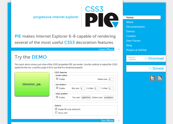
CSS3 PIE: CSS3 decorations for IE


CSS3 PIE: CSS3 decorations for IE

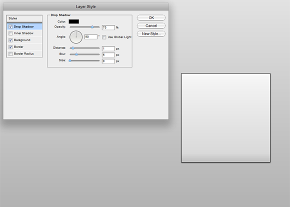
CSS3 Layers Builder


CSS3 Layers Builder

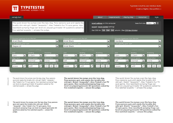
Typetester: Compare fonts for the screen


Typetester: Compare fonts for the screen

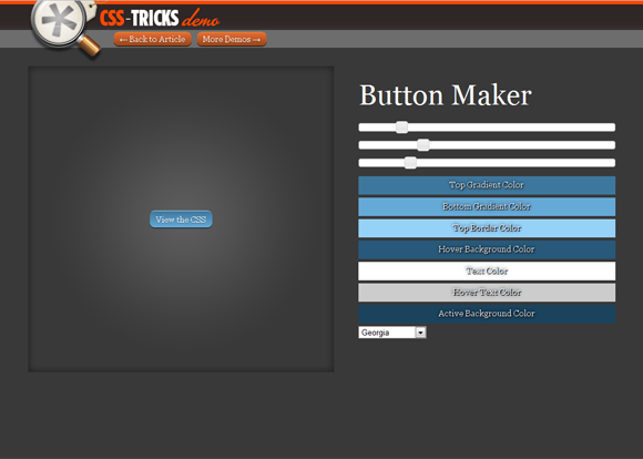
CSS-Tricks: Button Maker


CSS-Tricks: Button Maker

CSS3 Button maker 1.0


CSS3 Button maker 1.0

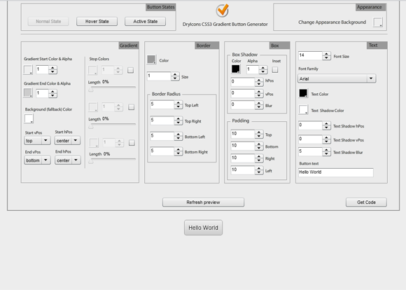
CSS3 Linear Gradient Buttons Generator


CSS3 Linear Gradient Buttons Generator

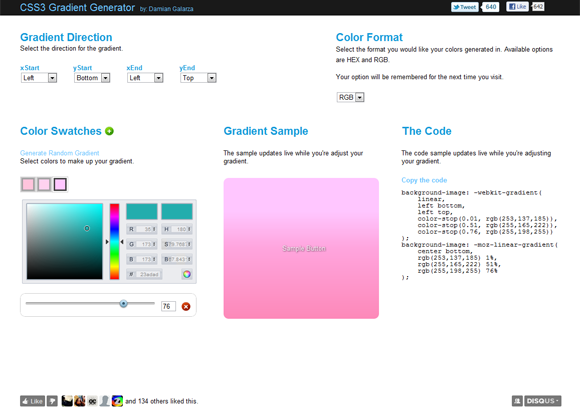
CSS3 Gradient Generator


CSS3 Gradient Generator

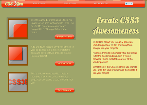
CSS3Gen: CSS3 Generator, Tools and Snippets


CSS3Gen: CSS3 Generator, Tools and Snippets

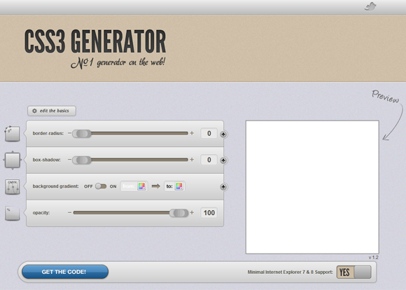
CSS3 Generator


CSS3 Generator

CSS3 Generator


CSS3 Generator

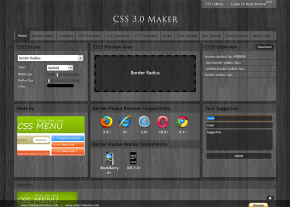
CSS3.0 Maker, Generator


CSS3.0 Maker, Generator

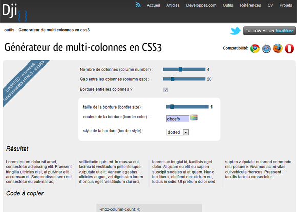
CSS3 Multi-Column Generator


CSS3 Multi-Column Generator

CSS3 Playground


CSS3 Playground

CSS3 Menu


CSS3 Menu

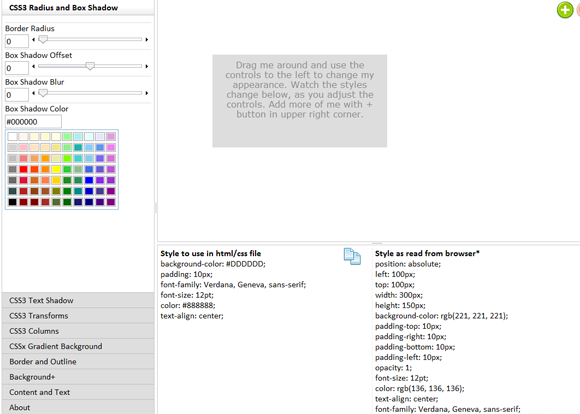
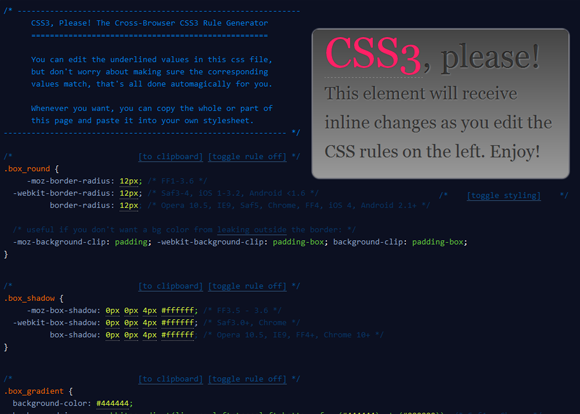
CSS3 Please: Cross-Browser CSS3 Rule Generator


CSS3 Please: Cross-Browser CSS3 Rule Generator

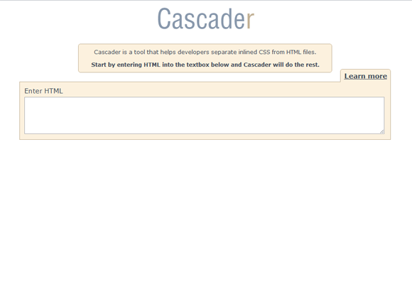
Cascader: Tool that helps developers separate inlined CSS from HTML files


Cascader: Tool that helps developers separate inlined CSS from HTML files

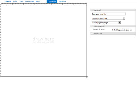
Drawter.com: DrawAble Markup Language


Drawter.com: DrawAble Markup Language

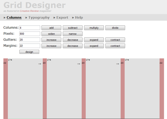
Grid Designer


Grid Designer

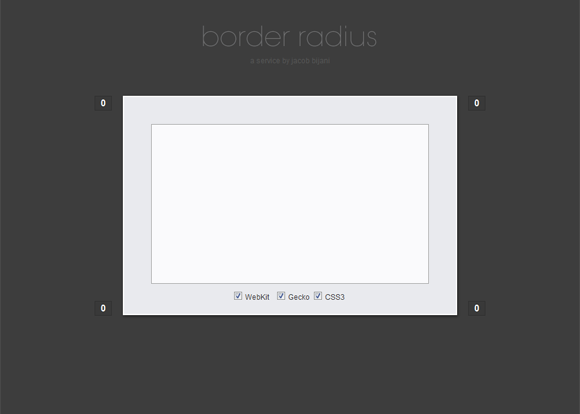
CSS Border Radius Generator


CSS Border Radius Generator

CSS33 Drop Shadow Generator


CSS33 Drop Shadow Generator

Sprite Cow: Generate CSS for sprite sheets


Sprite Cow: Generate CSS for sprite sheets

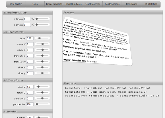
CSS3 3D Transforms


CSS3 3D Transforms

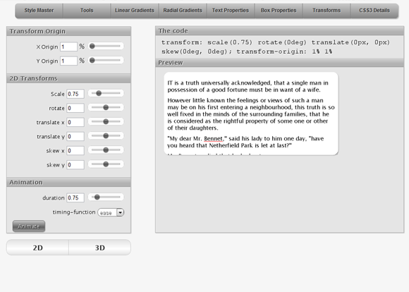
CSS3 Transforms


CSS3 Transforms

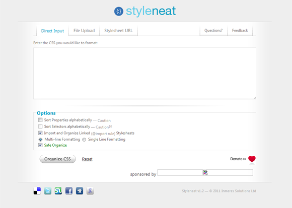
Styleneat: CSS Organizer


Styleneat: CSS Organizer

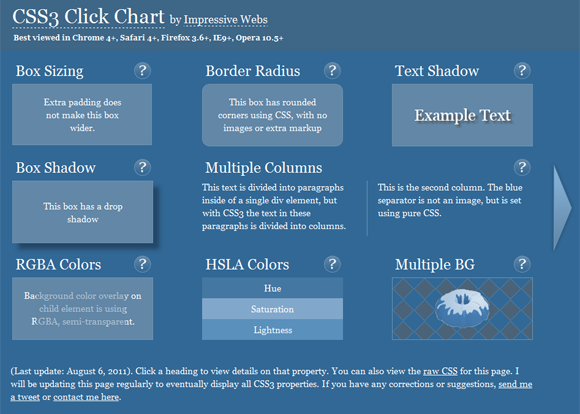
Impressive Webs: CSS3 Click Chart


Impressive Webs: CSS3 Click Chart

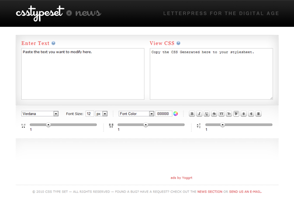
CSS Type Set


CSS Type Set

CSS Drive: CSS Compressor


CSS Drive: CSS Compressor

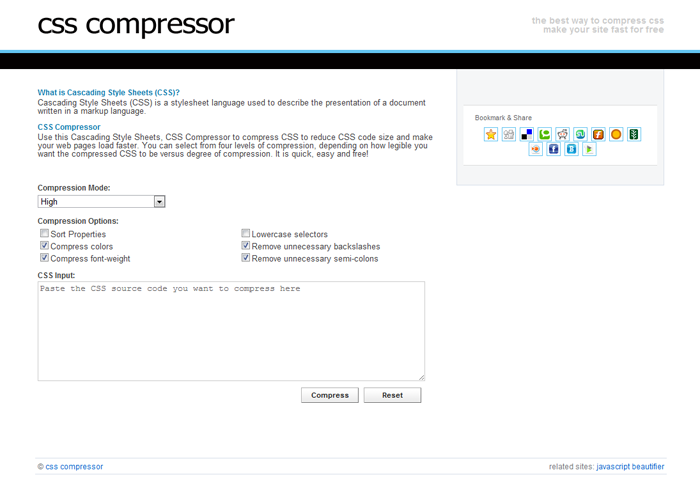
CSS Compressor


CSS Compressor

CSS Portal: Online CSS Editor


CSS Portal: Online CSS Editor

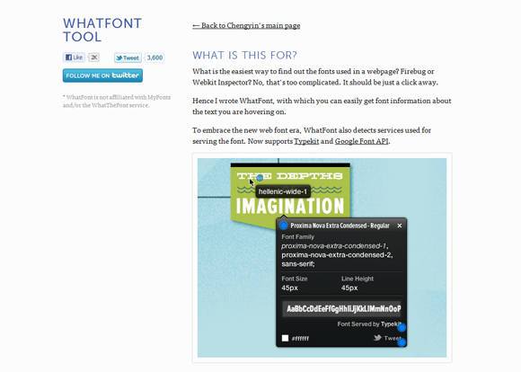
WHATFONT TOOL


WHATFONT TOOL

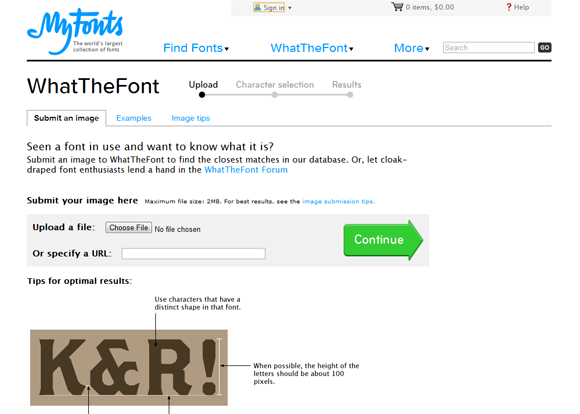
WhatTheFont


WhatTheFont

Font Dragr: Web App for Testing Custom Fonts


Font Dragr: Web App for Testing Custom Fonts

FontStruct: Build, Share and Download Fonts


FontStruct: Build, Share and Download Fonts

myFontbook.com: Font Viewer


myFontbook.com: Font Viewer

Font Squirrel: @FONT-FACE GENERATOR


Font Squirrel: @FONT-FACE GENERATOR

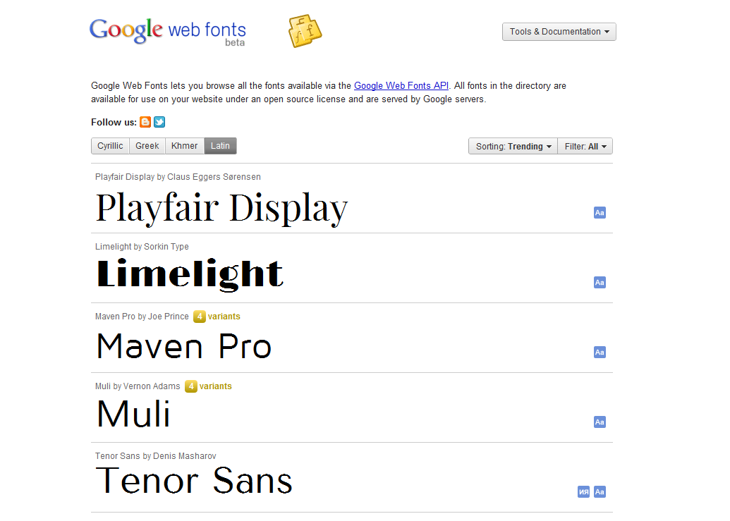
Google Web Fonts


Google Web Fonts

FFFFALLBACK: A Simple Tool for Bulletproof Web Typography


FFFFALLBACK: A Simple Tool for Bulletproof Web Typography

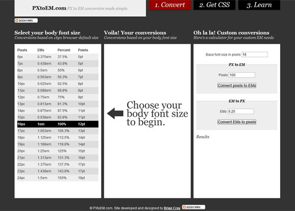
PXtoEM.com: PX to EM Conversion


PXtoEM.com: PX to EM Conversion

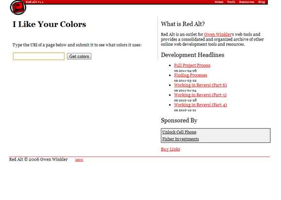
I Like Your Colors


I Like Your Colors

CSS3 Selectors Test


CSS3 Selectors Test

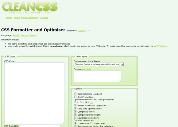
Clean CSS: Optmize and Format CSS


Clean CSS: Optmize and Format CSS

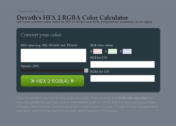
HEX 2 RGBA Color Calculator


HEX 2 RGBA Color Calculator

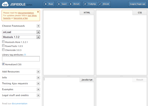
jsFiddle: Online Editor for the Web


jsFiddle: Online Editor for the Web

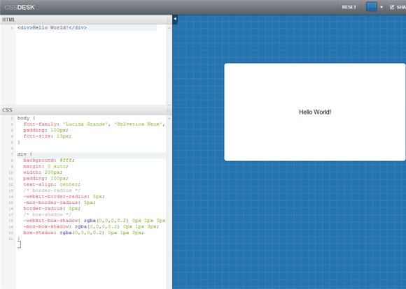
CSSDesk: Online CSS Sandbox


CSSDesk: Online CSS Sandbox

CSS3 Alternative to jQuery .fadeIn() or .fadeOut()

Suppose you have an image with some opacity(transparency), you will like it to be animated(with easing/smoothing effect) to none opacity on hover. This effect is seen in many many websites, and almost all of them use jQuery to achieve it. Even I used to use jQuery for this but while making a website recently I thought that it could be done using CSS instead of jQuery. So I tried it using transition CSS3 tags and I saw it could be easily done with CSS in place of jQuery. Using CSS3 instead of jQuery has many obvious advantages like faster load time of site, lesser heavier website, etc. The effect you achieve by using CSS is absolutely same as jQuery. Live demo can be seen at the end of this post.

The CSS

The CSS is really simple, you can use the below codes intact, or change them according to your requirements. 1s is time duration for the easing effect, ease-out is the easing type, you can even use ease-in, ease-in-out, linear, etc instead of ease-out here and opacity is the opacity/transparency of the element.

Default CSS for the element

{code type=CSS}
opacity: 0.6;
-webkit-transition: all 1s ease-out;
-moz-transition: all 1s ease-out;
-o-transition: all 1s ease-out;
-ms-transition: all 1s ease-out;
transition: all 1s ease-out;
{/code}

Hover CSS for the element

{code type=CSS}
opacity: 1;
-webkit-transition: all 1s ease-out;
-moz-transition: all 1s ease-out;
-o-transition: all 1s ease-out;
-ms-transition: all 1s ease-out;
transition: all 1s ease-out;
{/code}

jQuery Method

Just to compare, using jQuery we can do it like this:
{code type=HTML}

{/code}

Live Demo

Here is a live demo below for the fading effect using CSS, alternatively you can click here.

And doing the same using jQuery(Or click here).

If you will like to see them side by side, you can go here, the left frame uses the CSS3 method and the right frame uses the jQuery method.

Further Reading

Below are the pages of CSS tags used in above codes.