Simple React Typeahead & Faster Array Filter

Here is a super simple yet nicely working React typeahead I created couple of days ago after pretty much not being able to find any bug free & lightweight typeahead for React.

It’s weird because while there are too many Typeahead[s] for AngularJS, while I guess React is still in the awkward teenage phase.

Also, I ended up creating a custom Array filter, because well, it is evidently much faster than the native Array.prototype.filter().

The faster Array filter can be defined as:

Array.prototype.where = Array.prototype.where || function(t) {
  var results = [];

  for(var i = 0, len = this.length; i < len; i++) {
    var item = this[i];

    if (t(item)) {
      results.push(item);
    }
  }

  return results;
};

Although I don’t think there is going to be any noticeable difference unless the size of array is quite large.

Function Maps in JavaScript

var map = {
  functionOne: function(obj) {
    return console.info('I am at functionOne: %o', obj);
  },
  functionTwo: function(obj) {
    return console.info('I am at functionTwo: %o', obj);
  },
  functionThree: function(obj) {
    return console.info('I am at functionThree: %o', obj);
  }
};

C like function map which can then be used like map.functionOne({foo: 'bar'}).

I prefer to use objects like these instead of more typical control flow statements like if/else or switch. The map object can be called like map[key]({hello: 'World'}) , where key is the string.

Suppose you’re getting a data array of objects from some request, I can very neatly check all the items using something like this:

var arr = data.map(function(item){
    return item[map[key](item)];
});

Copy JavaScript Array with All Items Except One

var newArr = (newArr = oldArr.slice(), newArr.splice(newArr.indexOf(item), 1), newArr);

By combining JavaScript’s comma operator, Array slice and Array splice, we can conditionally duplicate JavaScript arrays.

Example code:

// Removing '3' from the new Array.
var a = [1, 2, 3, 4, 5];
var b = (b = a.slice(), b.splice(2,1), b);
// b = [1, 2, 4, 5];

Here we have to use a.slice() to copy Array a to b. Otherwise changes made to b would reflect on a as well.

Further Reading

A Guide to Future Proof Mobile/Tablet Friendly Websites

Tablet and Phones
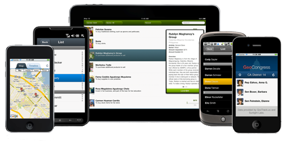
In a matter of couple of years, more than half of total web browsing will be done from mobile devices, however, mobile devices don’t necessarily provide the same design implementation as desktop computers do and many of times we see our websites breaking on those small screens, while many designers create tablet/mobile specific website, but I think maintaining one website is better than maintaining two separate ones. Below I will discuss some importanr things which we can keep in mind while creating a website to make it future proof for mobile devices as well as desktop computers.

Use Responsive Frameworks

Responsive Web Design
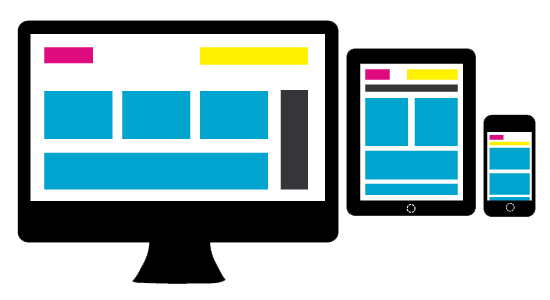
Getting back to the idea of two separate websites, I don’t think it pleases me or anyone much, we are better off doing one Responsive Website. Well, what is this Responsive Website exactly? Wikipedia defines Responsive Web Design as

Responsive Web Design (RWD) essentially indicates that a web site is crafted to use Cascading Style Sheets 3 media queries, an extension of the @media rule, with fluid proportion-based grids, to adapt the layout to the viewing environment, and probably also flexible images. Which means, having a responsive website enables us serve all devices via a single website, it enables us to address the ever-changing screen sizes, orientations and resolutions by using a flexible/fluid grid which will adapt to any screen size (and resolution). With responsive design, we have one website which serves all kinds of devices. This is in contrast from the other trend where we need to maintain at least two websites (desktop and mobile version). It has an obvious major advantage of far easier maintenance (now we maintain one instead of two websites). The essential concept of responsive design is minimum (or no) of resizing, scrolling (horizontal) and panning. There are many frameworks for fluid grids out there, I like the the 1140px CSS Grid and those who are loyal to 960px width can check out Gumby 960 CSS Framework.

Use Media Queries, everywhere

Media queries are certainly the most important part of responsive websites. Media queries were restricted in CSS2 to only screen, print and all, but, in CSS3 they are far more robust. We can now apply different stylesheets/styles based on the size of the viewport and pixel densities. Generally, for the most part, website implementation looks similar in tablets and desktops, however, many elements tend to get implemented (or displayed) differently in tablets, we can fix those elements using specific CSS thanks to media queries, also, we can differentiate how a particular element or the whole website will look in small screen phones, smart phones, tablets and desktops using media queries only. Here I am sharing some essential media queries.

Media Query for Normal Phones

We can include all of our phone specific styles within this block:

@media only screen and (min-device-width: 320px) and (max-device-width: 480px) {
    /* ==================================== */
    /* ! All phone specific CSS goes here */
    /* ==================================== */
}

Media Query for Smart Phones

The difference between a smartphone and a normal phone is resolution, smart phones will always higher resolution than normal phones, we can include all of our smart phone specific styles within this block:

@media handheld,
only screen and (max-width: 767px) {
    /* ========================================= */
    /* ! All smartphone specific CSS goes here */
    /* ========================================= */
}

Media Query for Tablets

We can use the below media query for all of our tablet specific styles, do keep in mind this will not get applied to those 10 inches tablets like Motorola Xoom, Toshiba Thrive, etc and will get applied to small/old monitors.

@media only screen and (min-device-width: 600px) and (max-device-width: 1024px) {
    /* ===================================== */
    /* ! All tablet specific CSS goes here */
    /* ===================================== */
}

Media Query for New Retina Displays

If we have some high resolutions assets which we will like to be applied to iPhone 4, iPhone 4S and iPad 3, then we can use the below block:

@media only screen and (-webkit-min-device-pixel-ratio: 2) {
    /* =================================== */
    /* ! Higher resolution CSS goes here */
    /* =================================== */
}

Taking Care of Orientation Problems As I discussed in my post:

Making Devices on Portrait Orientation Behave like Mobile, some websites get screwed in portrait orientation, read there only how it happens and why I strongly recommend to use the below media query.

@media handheld,
only screen and (max-width: 767px),
screen and (orientation: portrait) {
    /* ========================================================================= */
    /* ! All phone and tablets(in portrait orientation) specific CSS goes here */
    /* ========================================================================= */
}

Design Light and Fast Websites

Fast Websites
The CPU of a mobile device is not same as of a desktop computer, thus if we are using a lot of high resolution assets like images and videos, we should give it a second thought from the perspective of mobile devices, also, loading a lot of jQuery/JavaScript for animations and other effects will most likely deteriorate the performance of our website and the website will tend to hang frequently, to overcome this, make sure the website made is light weight and simple, a simple website is definitely a winner for mobile devices as it can also be used easily. Also, we should try reducing requests around network to minimum, some techniques for reducing HTTP requests include using CSS Sprites, combining (and compressing) multiple stylesheets/JavaScript files into one and using Data URI whenever possible. Data URIs are means to inline data in web pages, that is no external HTTP Request, here is one website to encode Data URIs. Back to JS, we should try and load all JavaScript in the end as it will increase the overall performance or at least we can use defer and async attributes (HTML5 only), furthermore, a lot of JS becomes useless for mobile device anyways, we should simply not load them by checking for user agent, here is JS snippet which pretty much checks for every mobile and tablet around:

var mobile = (/iphone|ipod|android|blackberry|opera mini|opera mobi|skyfire|maemo|windows|phone|palm|iemobile|symbian|symbianos|fennec/i.test(navigator.userAgent.toLowerCase()));
var tablet = (/ipad|android 3|sch-i800|playbook|tablet|kindle|gt-p1000|sgh-t849|shw-m180s|a510|a511|a100|dell|streak|silk/i.test(navigator.userAgent.toLowerCase()));
if (mobile) { /* JS for mobile devices */ } else if (tablet) { /* JS for tablets */ } else { /* JS for everything else */ }

This is not a 100% bullet proof method, but there is nothing to lose.

Dealing with Hardware

A4
One thing to remember while building mobile websites is that they don’t have any mouse or keyboard, so all keyboard jQuery for navigation will not work, also, since there is no mouse, there are no hover effects. Building navigation menu for tablets is little tricky, although most tablets like iPad make most of the navigation menus easily usable, however, in some tablets like PlayBook, making our navigation menu work is real pain, especially the ones with sub menus (since they use hover), we need to carefully CSS between :hover and :active pseudo classes (as they are practically same for mobile devices). Whitespacing is another crucial element in mobile devices, we don’t want our website to look in clutter and we must build elements, especially clickable elements with decent amount of padding **and adequate **spacing so that our fingers can tap easily on them (since our fingers are much more thicker than mouse pointers and some times it gets irking when we can not click items and need to zoom-in to do so). Besides, check out jQuery Mobile for adding touch gestures to websites.

Ditch Flash

Flash
Most of us are already aware of that many mobile devices like iPhones, iPads, Windows Phones, Chrome on Android, etc don’t have flash, even if some do, flash experience on them is not the same as in desktop computers, thus we should certainly not use it. We can use jQuery animation instead of flash to achieve most of the effects and where flash is absolutely necessary, we can do conditionals to check for flash and then execute the suitable code. SWFObject is an easy to use and standards friendly method to embed Flash content, which utilizes one small JavaScript file, we should use this where we absolutely need to use flash.

And finally, not all tablets are Webkit, use standardized properties!

Windows 8 Tablet
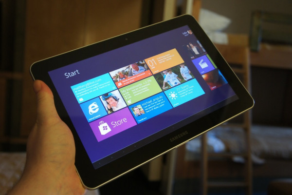
I know this will sound weird to most of you, especially since currently every tablet (probably) is on Webkit and thus what we tend to do is use those non standardized -webkit only CSS3 without their other counterparts, though it is very helpful and it works (and we should use them), but there are problems because of this, let me illustrate one. A decade ago, IE6 was the most dominant web browser in the world, the whole Internet was full of websites made only for IE6, the users of other browsers were discontented. Though that particular problem is over now, but it is back in another form now, Webkit. Webkit is the rendering engine used by almost every modern mobile device (except a very few) and hence the mobile Internet is now full of Webkit only websites, now what if in future tablets ditch Webkit? And that future might not be very distant, later this year, Microsoft will introduce its flagship for tablet operating system, Windows 8, and as far as I can tell from its release preview and beta, its quite good, and its success wont be any surprise, however, it will be a surprise for designers when most of their websites wont work on it’s default web browser. Similarly, Firefox and Opera also have a decent share of mobile browsing, those -webkit properties wont work on even them (although Opera supports some -webkit properties). So to avoid all this, we are better off using standardized CSS properties for most of our designing and use -webkit properties with their -moz, -ms, -o and prefixless counterparts. Prefixr.com can help you to make your cross-browser CSS.

Further Reading [unordered_list style=”arrow”]

Handy Collection of JavaScript Prototypes

Here is a handy collection of JavaScript prototypes compiled by James Haley, I personally found these quite useful and thus I am sharing them. These are pretty much self explanatory snippets and perform some regular tasks.

Array Remove – By John Resig (MIT Licensed)

Array.prototype.remove = function(from, to) {
    var rest = this.slice((to || from) + 1 || this.length);
    this.length = from < 0 ? this.length + from : from;
    return this.push.apply(this, rest);
};

Trim spaces

String.prototype.trim = String.prototype.trim || function() { return this.replace(/^\s+|\s+$/,""); }

Remove last full stop prototype

String.prototype.trimFullStops = function() { return this.replace(/^\.+|\.+$/,""); }

New line remove prototype

String.prototype.replaceNewLine = function() { return this.replace(/(\r\n|\r|\n)/g, ""); }

Replace breaks remove prototype

String.prototype.replaceBreaks = function() { return this.replace(/<br \/>|<br\/>/g, "\n"); }

String Trim to length or first Stop(.)

String.prototype.short = function(nLen) {
  var nFSPos = this.indexOf('.');
  return (this.length > nLen) ? ((nFSPos > -1) && (nFSPos < nLen + 1) && (nFSPos > 3)) ? this.split('.')[0].trim() + '…' : this.substring(0, nLen).trim() + '…' : this;
};

Encode for URL transport

String.prototype.encode = function() { return (this.length>0)?encodeURIComponent(this):this; };

Replace JS quotes

String.prototype.replaceQuotes = function() { return this.replace(/"/g,"\\\""); }

HTML remove tags prototype

String.prototype.stripTags = function() { return this.replace(/<\S[^>]*>/g, ""); }

Fix Numeric

String.prototype.tidyNumeric = function() { return Math.abs(this.replace(/[^0-9.]/ig,'').trimFullStops()); };

Tidy Decimal

Number.prototype.tidyDecimal = function(n) { return Math.abs(this.toFixed(n)); }

Convert to EM (base size 12px)

Number.prototype.toEm = function() { return (this/12).tidyDecimal(3); }

Right and Left cut

String.prototype.left = function(n) { return this.substr(0,n); }; String.prototype.right = function(n) { return this.substr((this.length-n),this.length); };

Convert date object into friendly string

Date.prototype.toClean = function() {
   if (this !== null) {
       var vDay = ((this.getDate()) < 10) ? '0' + (this.getDate()) : (this.getDate()),
           oMonths = ['Jan', 'Feb', 'Mar', 'Apr', 'May', 'Jun', 'Jul', 'Aug', 'Sep', 'Oct', 'Nov', 'Dec'],
           vMonth = oMonths[this.getMonth()],
           vYear = this.getFullYear().toString().right(2);
       return vDay + ' ' + vMonth + ' \'' + vYear;
   } else {
       return '[Invalid Date]';
   }

}

Convert date object into SQL supported

Date.prototype.toSQL = function() {
    var vDay = ((this.getDate()) < 10) ? '0' + (this.getDate()) : (this.getDate()),
        nMonth = (this.getMonth() + 1),
        vMonth = (nMonth < 10) ? '0' + nMonth : nMonth,
        vYear = this.getFullYear().toString(),
        vHours = ((this.getHours()) < 10) ? '0' + (this.getHours()) : (this.getHours()),
        vMinutes = ((this.getMinutes()) < 10) ? '0' + (this.getMinutes()) : (this.getMinutes()),
        vSeconds = ((this.getSeconds()) < 10) ? '0' + (this.getSeconds()) : (this.getSeconds());
    return vDay + '/' + vMonth + '/' + vYear + ' ' + vHours + ':' + vMinutes + ':' + vSeconds;
}

Remove all punctuation

String.prototype.clearPunc=function(){ return this.replace(/[\.,-\/#!$%\^&\*;:{}=\-_`~()]/g,"").replace(/\s{2,}/g," "); }

Highlight words by passed in value

String.prototype.highlight = function(vWords) {
    var oWords = vWords.clearPunc().stripTags().split(' '),
        vNewPhrase = this;
    oWords.each(function(o) {
        vNewPhrase = vNewPhrase.replace(new RegExp("(" + o + ")", "ig"), '<span class="highlight">$1</span>');
    });
    return vNewPhrase;
}

Detecting iPad 3 For Specific Stylesheet and Images

Displaying Retina Images

A basic script to replace the normal images with the iPad 3 optimized image(i.e. high resolution images), all you need to do is just keep the high resolution image with a “retina” extension. For example, imageABC.png becomes imageABCretina.png. Read here why you should do so.

<script type="text/javascript"> 
    $(document).ready(function() {
        var pixelRatio = window.devicePixelRatio ? window.devicePixelRatio : 1;
        images = document.getElementsByTagName("img"), num = images.length;
        if (navigator.userAgent.indexOf('iPad') >= 0 && pixelRatio >= 2 && ((screen.width == 768 && screen.height == 1024) || (screen.width == 1024 && screen.height == 768))) {
            for (i = 0; i <= num - 1; i++) {
                var temp = images[i].attributes['src'].value,
                    src = temp.substr(0, temp.lastIndexOf('.')) + 'retina' + temp.substr(temp.lastIndexOf('.'));
                images[i].src = src;
            }
        }
    });
</script> 

I am checking for user agent, screen width and pixelRatio since the screen width will double check that the device is an iPad and the pixel ratio will make sure its a 3rd Generation iPad, if we just use the pixelRatio, then this snippet will also apply for new iPhones(as they also have pixel ratio of 2). The screen width tends to remain 768 no matter what is the orientation(unlike other tablets in which they interchange if tilted), but I have still checked for other orientation if Apple ever decides to change how screen width and height are reported based on the device’s orientation.

iPad 3 Specific Stylesheet Similarly, we can also use iPad 3 specific stylesheet with a little help of

jQuery. Do notice here that earlier iPad(s) had 1024 x 768 resolutions, thus media queries specific to them will also work with the new iPad(since the iPad 3 also returns the same resolution only despite of being 2048 x 1536). This shows how you can even detect the landscape and portrait modes on the iPad(s).

<script type="text/javascript">
    $(document).ready(function() {
        var pixelRatio = window.devicePixelRatio ? window.devicePixelRatio : 1;
        if (navigator.userAgent.indexOf('iPad') >= 0 && pixelRatio >= 2 && ((screen.width == 768 && screen.height == 1024) || (screen.width == 1024 && screen.height == 768))) {
            $('head').append('<link rel="stylesheet" href="iPad3.css" type="text/css" />');
        }
    }); 
</script> 

Another way to achieve it using basic HTML is:

<link rel="stylesheet" media="only screen and (min-device-width: 768px) and (max-device-width: 1024px) and (-webkit-min-device-pixel-ratio: 2)" type="text/css" href="iPad3.css" />

Special thanks to Sean Smith for debugging and fixing code.

Simple Tooltip using jQuery

There are bunch of jQuery/JavaScript Tooltip plugins available on Internet, but most of them are heavy, and since generally our requirement is not that much, they become unfavorable to use. Thus, I wrote a small and simple code snippet for Tooltips which can be achieved via jQuery, it is easy to implement and use. CSS3 Tabs with CSS3 Navigation Menu
Live Demo
// Download

The Code

The JavaScript

Unlike other plugins for this same functionality, the JavaScript/jQuery code here is really small(and assumes that you have already included the jQuery library).

$(document).ready(function() {
    $('.simpleTooltip').hover(function() {
        var title = $(this).attr('title');
        $(this).data('tipText', title).removeAttr('title');
        $('<p class="tooltip"></p>').text(title).appendTo('body').fadeIn('slow');
    }, function() {
        $(this).attr('title', $(this).data('tipText'));
        $('.tooltip').remove();
    }).mousemove(function(e) {
        var mousex = e.pageX + 20;
        var mousey = e.pageY + 20;
        $('.tooltip').css({
            top: mousey,
            left: mousex
        })
    });
});

The CSS

This is the CSS for the actual tooltip, I have added some additional styling properties like circular borders, opacity and box shadow, though they are completely optional. If you encounter problems with width of the tooltip, you might try fixing the width of the tooltip rather than auto.

.tooltip {
    display: none;
    position: absolute;
    opacity: 0.80;
    width: auto;
    background-color: #000;
    padding: 10px;
    color: #fff;
    -webkit-border-radius: 5px;
    -moz-border-radius: 5px;
    border-radius: 5px;
    -moz-box-shadow: 0 0 3px 3px #959595;
    -webkit-box-shadow: 0 0 3px 3px #959595;
    box-shadow: 0 0 3px 3px #959595;
}

The HTML

The HTML again is very simple, just add the class simpleTooltip to any anchor link, and it’s title becomes the tooltip.

<a href="#" title="Text to be displayed in Tooltip" class="simpleTooltip">Hover for Tooltip</a>

Prevent or Disable Copy or Paste In Input Fields

Using jQuery we can disable or prevent copy or pasting of input fields, jQuery has built-in access to this functionality in browsers by exposing them as events, that is by binding any input element like text input, text area, etc, with these events and calling the preventDefault() event which prevents the user from copy or pasting text into these fields. We observe these in many forms, especially ones those of more secure websites(like online banking). Check out the below snippets of its implementation.

Disable Copying

$('input').bind('copy', function(e) { e.preventDefault(); });

Disable Copying and Pasting

$('input').bind('copy paste', function(e) { e.preventDefault(); });

Redirect Website to PC/Windows, Mac and Linux/Ubuntu Version

Here is a JavaScript code snippet for PC/Windows, Mac and Linux/Ubuntu User Agent Detection and then redirecting them to their version of website. Earlier I’d also posted how we can easily redirect website to their respective iPhone/iPod/iPad version, you might like to check that out as well. Replace PC Version with PC Version of your Website and Mac Version for Mac Version of your Website and Linux Version with Linux Version of your Website in the below code.

<script type="text/javascript">
    if ((navigator.userAgent.match(/MSIE/i)) || (navigator.userAgent.match(/Windows/i))) {
        location.replace("PC Version");
    } else if (navigator.userAgent.match(/Macintosh/i)) {
        location.replace("Mac Version");
    } else if (navigator.userAgent.match(/Linux/i)) {
        location.replace("Linux Version");
    }
</script>

Bottom Or Center Aligning Element using JavaScript and jQuery

Recently I had to bottom align an element on one of my website template, I knew there were many methods for doing it using CSS. But the CSS codes just won’t work for my template because of many reasons, but I was quickly able to figure out how I could do this using JavaScript. Below I am sharing how we can bottom align or center align an element using JavaScript and jQuery.

Including jQuery

First of all we will need to include the jQuery JavaScript Library since we will be using jQuery. At least jQuery Version 1.2 will be needed for the functioning of the below code(s). Though the .css() has been in jQuery since Version 1.0 but the position CSS property was included in jQuery Version 1.2.

{code type=HTML}

{/code}

I have included the compressed version of jQuery Version 1.2 library. However, I recommended to include the latest version of jQuery JavaScript Library. For the latest version, simply include this instead.

{code type=HTML}

{/code}

Function For Center Aligning the Element

Writing the function is not really difficult, here is the function below for Center Aligning:
{code type=HTML}

{/code}

Function For Bottom Aligning the Element

And for Bottom Aligning:
{code type=HTML}

{/code}

In the above code(s) FunctionName is your desired function name and #ElementName is the id of the element which you want to center or bottom align, you can even use this keyword here.

Calling Function

After writing the function, simply call it.

{code type=HTML}

{/code}

Demonstration

You can see a live demo for Center Aligning an element here.
And for Bottom Aligning an element here.

Note

Though this method works most of the time, but still if you see it not functioning properly or not perfectly center or bottom aligning the element, then manually add some numerical pixel values to the variables used above.