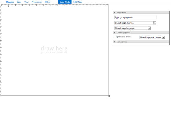
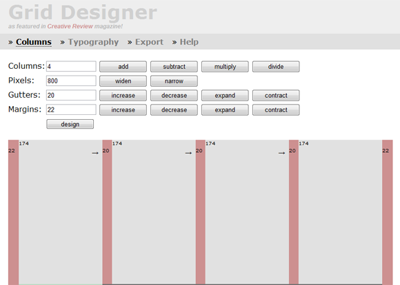
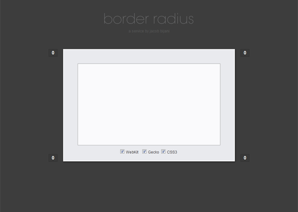
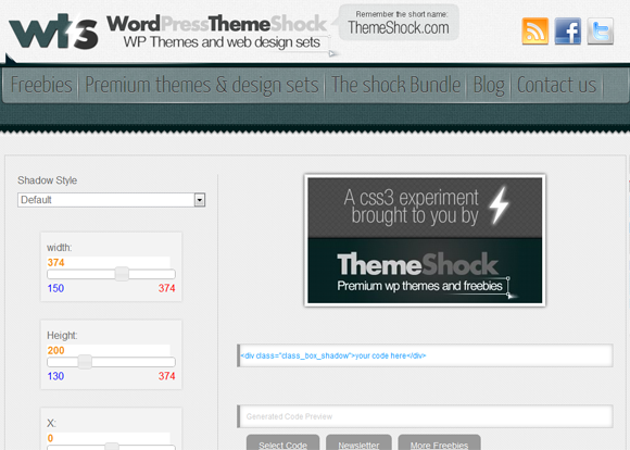
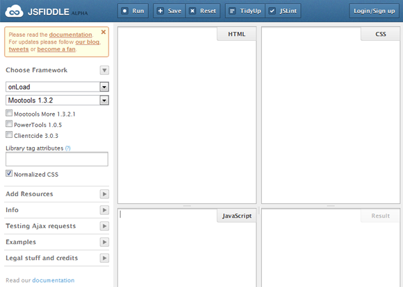
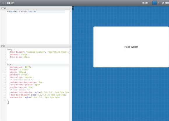
CSS is the language used to design websites and is used by various kinds of people ranging from ultra professionals to newbies. Below I am sharing 45 of the best CSS Tools or CSS Resources, tools which can reduce a lot of your work or help you in writing the CSS. Many of these are specifically for CSS3 too. Browse them out to know more, do drop by if you also know a ‘good’ online CSS tool.
CSS
CSS3 Alternative to jQuery .fadeIn() or .fadeOut()
Suppose you have an image with some opacity(transparency), you will like it to be animated(with easing/smoothing effect) to none opacity on hover. This effect is seen in many many websites, and almost all of them use jQuery to achieve it. Even I used to use jQuery for this but while making a website recently I thought that it could be done using CSS instead of jQuery. So I tried it using transition CSS3 tags and I saw it could be easily done with CSS in place of jQuery. Using CSS3 instead of jQuery has many obvious advantages like faster load time of site, lesser heavier website, etc. The effect you achieve by using CSS is absolutely same as jQuery. Live demo can be seen at the end of this post.
The CSS
The CSS is really simple, you can use the below codes intact, or change them according to your requirements. 1s is time duration for the easing effect, ease-out is the easing type, you can even use ease-in, ease-in-out, linear, etc instead of ease-out here and opacity is the opacity/transparency of the element.
Default CSS for the element
{code type=CSS}
opacity: 0.6;
-webkit-transition: all 1s ease-out;
-moz-transition: all 1s ease-out;
-o-transition: all 1s ease-out;
-ms-transition: all 1s ease-out;
transition: all 1s ease-out;
{/code}
Hover CSS for the element
{code type=CSS}
opacity: 1;
-webkit-transition: all 1s ease-out;
-moz-transition: all 1s ease-out;
-o-transition: all 1s ease-out;
-ms-transition: all 1s ease-out;
transition: all 1s ease-out;
{/code}
jQuery Method
Just to compare, using jQuery we can do it like this:
{code type=HTML}
{/code}
Live Demo
Here is a live demo below for the fading effect using CSS, alternatively you can click here.
And doing the same using jQuery(Or click here).
If you will like to see them side by side, you can go here, the left frame uses the CSS3 method and the right frame uses the jQuery method.
Further Reading
Below are the pages of CSS tags used in above codes.
Make CSS Cross Browser Compatible in Seconds
Nettuts+ has launched a new amazing website Prefixr using which you can make your CSS3 Cross-Browser Compatible in Seconds, now you can write the whole stylesheet keeping in mind just one engine/web browser(like webkit or moz) and let this website make it compatible with all other engines/web browsers by adding their respective tags. Prefixr will filter through the applicable CSS3 properties and dynamically update them.
The website is up at http://prefixr.com/. It also given an option to compress the CSS and provides API if you want to execute it directly from your text editor.
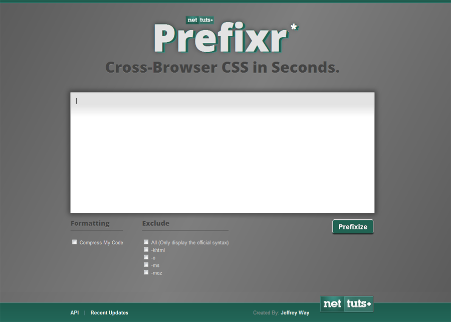
Please remember this website is still in Alpha stages and has some bugs like no support for properties like “border-top-left-radius“.
Filling a Glass with Water (Using CSS3)
HTML5 is amazing and list of things which can be done using it is endless. Anyways, I am sharing how we can fill an empty glass with water using HTML5, I am sharing the code snippets for it. Let me know your thoughts on it. A modern web browser(Like Firefox, Chrome, Opera, Safari) will be needed for it. The live demonstration of this can be seen at the end of this post.
The HTML
The HTML is really simple, it has three divs, first for container of the glass, second for the glass and the third for the water in it. The first div(container) is not really necessary.
{code type=HTML}
{/code}
The CSS
This is where it gets a little tricky, the #container has the general styling properties for the container, the #glass again has general CSS properties of the glass. Now in #water, a background image has been used for waves for the water, you can also specify a color instead of the background image if you don’t need the waves. Then comes the transition CSS properties, transition tags are used here for the easing effect after the hover action(when the water has to fall down). Then finally #glass:hover #water comes which defines the CSS properties when the user hovers over the element, transition properties are the CSS tags responsible for these easing effects.
{code type=CSS}
#container {
background: rgba( 0, 0, 0, 0.10);
margin-left:auto;
margin-right:auto;
width: 300px;
border-left: 1px solid #bbb;
border-right: 1px solid #bbb;
border-bottom: 1px solid #bbb;
border-top: 1px solid #ccc;
-webkit-border-radius: 10px;
-moz-border-radius: 10px;
border-radius: 10px;
padding-left: 5px;
padding-right: 5px;
padding-bottom: 30px;
padding-top: 5px;
}
#glass {
background: rgba( 255, 255, 255, 0.50);
border: 1px solid #bbb;
border-top: 1px solid #eee;
-webkit-border-radius: 10px;
-moz-border-radius: 10px;
border-radius: 10px;
width: 300px;
height: 400px;
position: relative;
}
#water {
background-image: url(“waves.png”);
background-position: top right;
position: absolute;
bottom: 0px;
width: 300px;
height: 100px;
-webkit-transition: all 3s ease-out;
-moz-transition: all 3s ease-out;
-o-transition: all 3s ease-out;
transition: all 3s ease-out;
-webkit-border-radius: 10px;
-moz-border-radius: 10px;
border-radius: 10px;
}
#glass:hover #water {
height: 350px;
background-position: top left;
-webkit-transition: all 3s ease-out;
-moz-transition: all 3s ease-out;
-o-transition: all 3s ease-out;
transition: all 3s ease-out;
}
{/code}
Demonstration
Here is a demonstration below for filling a glass with water, alternatively you can click here.
Or if you don’t like the waves(Or click here).
Further Reading
Below are the pages of CSS properties used in above snippets.
CSS3 Magnification / Enlarge / Scale Effect
In this article I will share how we can have pure HTML5 magnification or enlarge or scale effect for various elements in a web page, with easing effects, by only using CSS3, that is without using any JavaScript or jQuery Plugin, of course a modern web browser(Recent Firefox, Chrome, Opera, Safari) will be needed for it. The live demonstration of this can be seen at the end of this post.
The CSS
The CSS has 2 parts, one for default effects and the other one for hover effects, following are the CSS snippets:
Default CSS for the element
{code type=CSS}
-webkit-transition: all 200ms linear;
-moz-transition: all 200ms linear;
-o-transition: all 200ms linear;
transition: all 200ms linear;
-webkit-transform: translateZ(0);
-moz-transform: translateZ(0);
-o-transform: translateZ(0);
transform: translateZ(0);
{/code}
Hover CSS for the element
{code type=CSS}
-webkit-transform: scale(1.1) translateZ(0);
-moz-transform: scale(1.1) translateZ(0);
-o-transform: scale(1.1) translateZ(0);
transform: scale(1.1) translateZ(0);
{/code}
Demonstration
When the above snippets will be implemented correctly, they will give you the magnification / enlarge / scale effect, I am also including a demonstration for how it will look live. I have used the above two CSS codes for the headline and the image.
Alternatively, you can see it here.
Further Reading
You can also try out ImageLens which is a jQuery plugin for giving lens effect while zooming images. Also, below are the pages of CSS properties used in above snippets.
[unordered_list style=”arrow”]
- transition – MDC Docs
- -moz-transform – MDC Docs
- Surfin' Safari – Blog Archive » CSS Animation
- Surfin' Safari – Blog Archive » CSS Transforms
- Opera: CSS3 Transitions support in Opera Presto 2.3
- Opera: CSS3 2D Transforms support in Opera Presto 2.4
[/unordered_list]
