While the recent trend towards “flat” design emphasizes solid color blocks and clean lines, the ability to use texture effectively is still a necessary and powerful tool in the designer’s toolbox. Your use of texture can range from subtle to bold, from colorful to monochromatic, from a slight accent to a focal element – there are virtually endless ways to use texture creatively in your designs. Texture can be used to add personality to your designs, produce a more immersive environment, and refine the visual experience.
Here are some examples of texture use to give you inspiration:
Jib
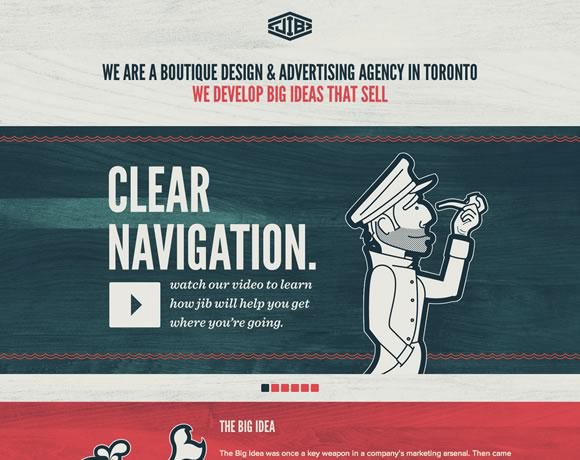 Jib is a design and advertising agency based out of Toronto. Their homepage uses a light wood grain texture to give the site a slight retro feel. This little bit of texture is subtle, but it completely transforms the feel of the site, giving the visitor the impression of age and authority.
You’ll notice that the wood grain spreads across the entire background. While it can be risky using the same texture across an entire page, in this case it works well with the designer’s color choices. It should go without saying, but always pay attention to how your texture choices interact with other elements of your design.
Italiokitchen
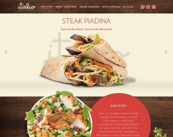 Here’s another example of wood grain, but used as an accent instead rather than as a background texture for the entire page. The contrast of these two examples shows how important it is to consider context when deciding how you’re going to apply texture to your design. You can make nearly any textural element work, provided you keep in mind context.
Marc Thomas
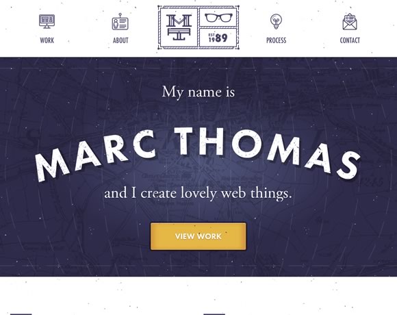 Texture doesn’t have to be something subtle you use to subtly alter the look and feel of your site – it can be the focal point of your design. This splash page is pretty much just a name, background, and call to action button, but the texture is what makes it work.
Here the design is enhanced by the map in the background that functions as a textural backdrop, and the little dots that give the site an “old-school” movie projector feel.
Lab Fiftyfive
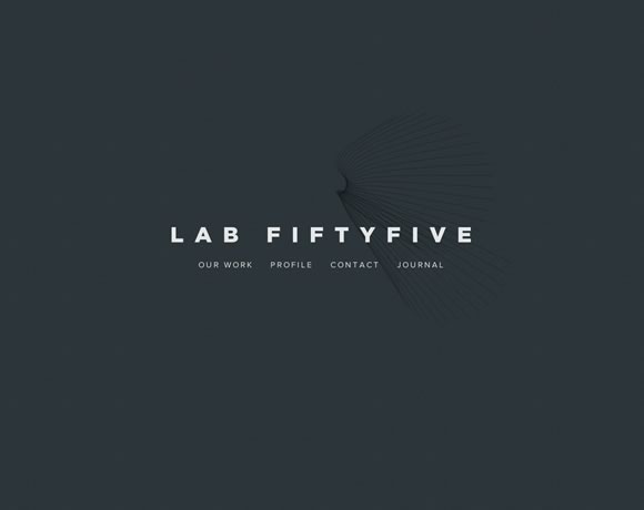 This example shows how you can use abstract background elements to accent a simple design. The hint of texture in the background gives this simple business card style layout a much needed element of depth.
This site would also be a great illustration of the power of typography, but perhaps that’s a discussion for another time.
Mode 87
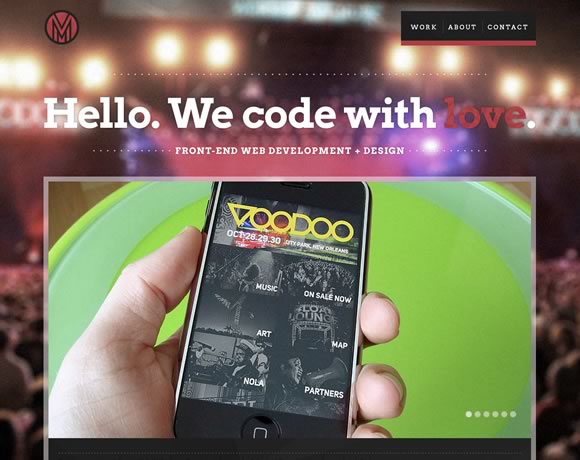 The old “photo as a background” technique is often overused, but there are certainly times when it works well. Here, the background photo is blurred, turning it into a more abstract background than if it were clearly defined. The background blurring also drives focus to the foreground element, which also gives the viewer the impression that they’re at a concert, but completely focused on their phone.
While background images aren’t strictly considered “textures”, a background image to one designer might be applied like a textural element to another. Don’t be afraid to try things that are out of the box.
Arkleus
 The use of noise here transforms just another background photo into a something else entirely. Note how the combination of noise texture and dark colors here gives the site a mysterious feel – perfect for a launch site.
I Shot Him
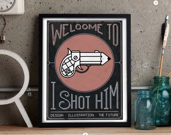 What about incorporating real life texture into your designs? Here’s a great reminder that texture isn’t a design “technique” – it’s a very real part of how we interact with our visual world. We’re surrounded by texture everywhere we look – but a great designer can manipulate that texture to create works of beauty, whether in the real or digital world.
It’s easy to get stuck in a design rut where you constantly go back to design elements that have worked for you in the past, but an important part of growing as a designer is to expand your comfort zone and continuously try new things. Hopefully these examples gave you a few new ideas of how you can incorporate texture into your own designs.
This guest article was written by Simon. He is currently working for Jangomail a cool provider.